GreenLeaf Organic — an identity that speaks of naturalness without unnecessary words.
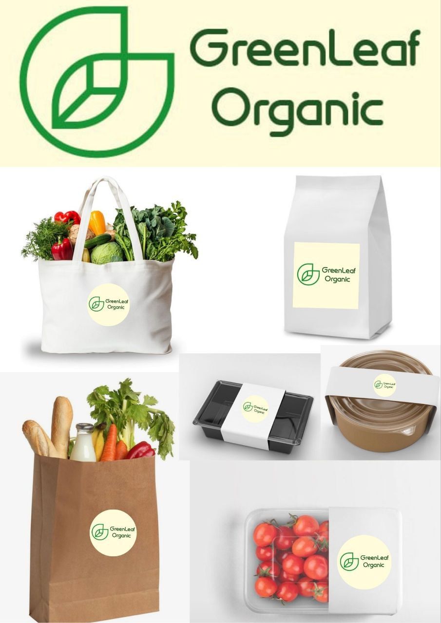
A minimalist sign in the shape of a leaf — simple, clean, and clear. The green color emphasizes eco-friendliness, while the soft light background adds a sense of lightness and trust.
I have thought about how the logo works in real life: on eco-bags, paper bags, product packaging, stickers. It is important for the brand to look cohesive on any medium — from kraft paper to plastic.
This is about care, naturalness, and a modern approach to an organic brand.
If you need an identity that looks clean, professional, and adaptable — message me directly.