The Icecream
Adaptive wing, breakdown point 480px, 768px, 1280px. For the mobile version of the site, the line is responsive. The site is correctly viewed in all possible sizes of the browser window and devices, dying from the width of 320px, both in portraitній and in albumній orientation.
The W3C Markup Validation Service (Unicorn)
Respecting semantics according to HTML5 standards.
Optimized dimensions of vector and breakthrough graphics
Support for retina screens
Optimize the load of images.
- Added a display of the favicon page.
Structure of the project:
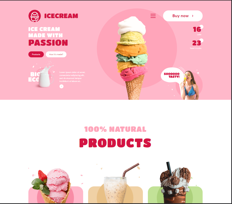
The Hero Header
- Products
About
The Advantages
The Gallery
Customer Reviews
Contacted
The Footer
The team project:
I was performed the Verstka and the switch of the modal icons, the message of the mobile window
The W3C Markup Validation Service (Unicorn)
Respecting semantics according to HTML5 standards.
Optimized dimensions of vector and breakthrough graphics
Support for retina screens
Optimize the load of images.
- Added a display of the favicon page.
Structure of the project:
The Hero Header
- Products
About
The Advantages
The Gallery
Customer Reviews
Contacted
The Footer
The team project:
I was performed the Verstka and the switch of the modal icons, the message of the mobile window
 Dnepr
Dnepr  Available for hire