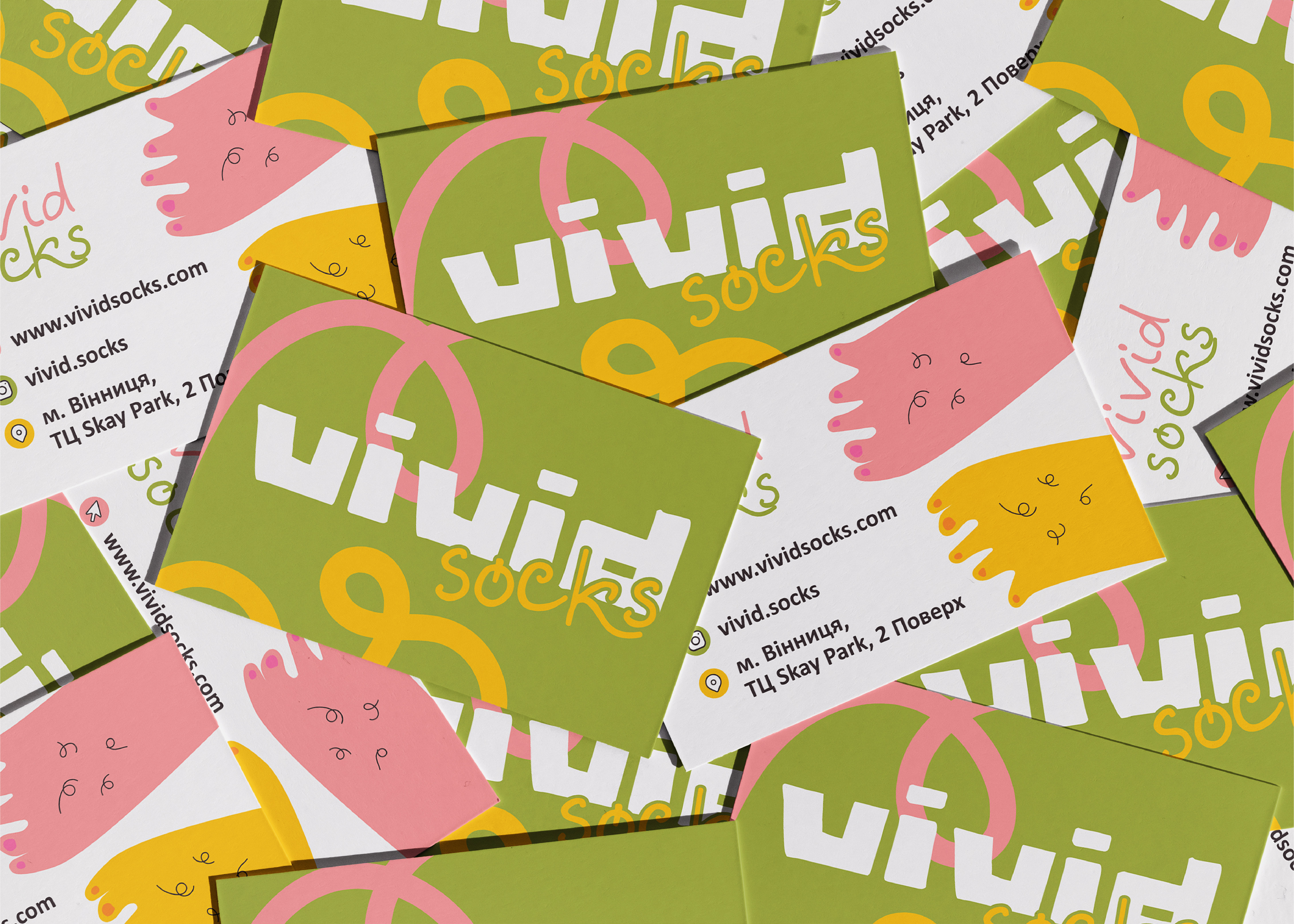
The logo is designed in the form of a ring, symbolizing a direct reference to the movie "The Lord of the Rings," with the hobbits' feet embodied in this form. The term "vivid" translates as bright or saturated, associated with adventures and emotions. Brightness can be associated not only with bright colors, but also with variety and the vibrant nature and creatures in this world, indicating the brand's character. Words expressing the uniqueness and style of the identity: bright / diverse / community / comfortable.