Brand identity for a flower studio
Corporate Style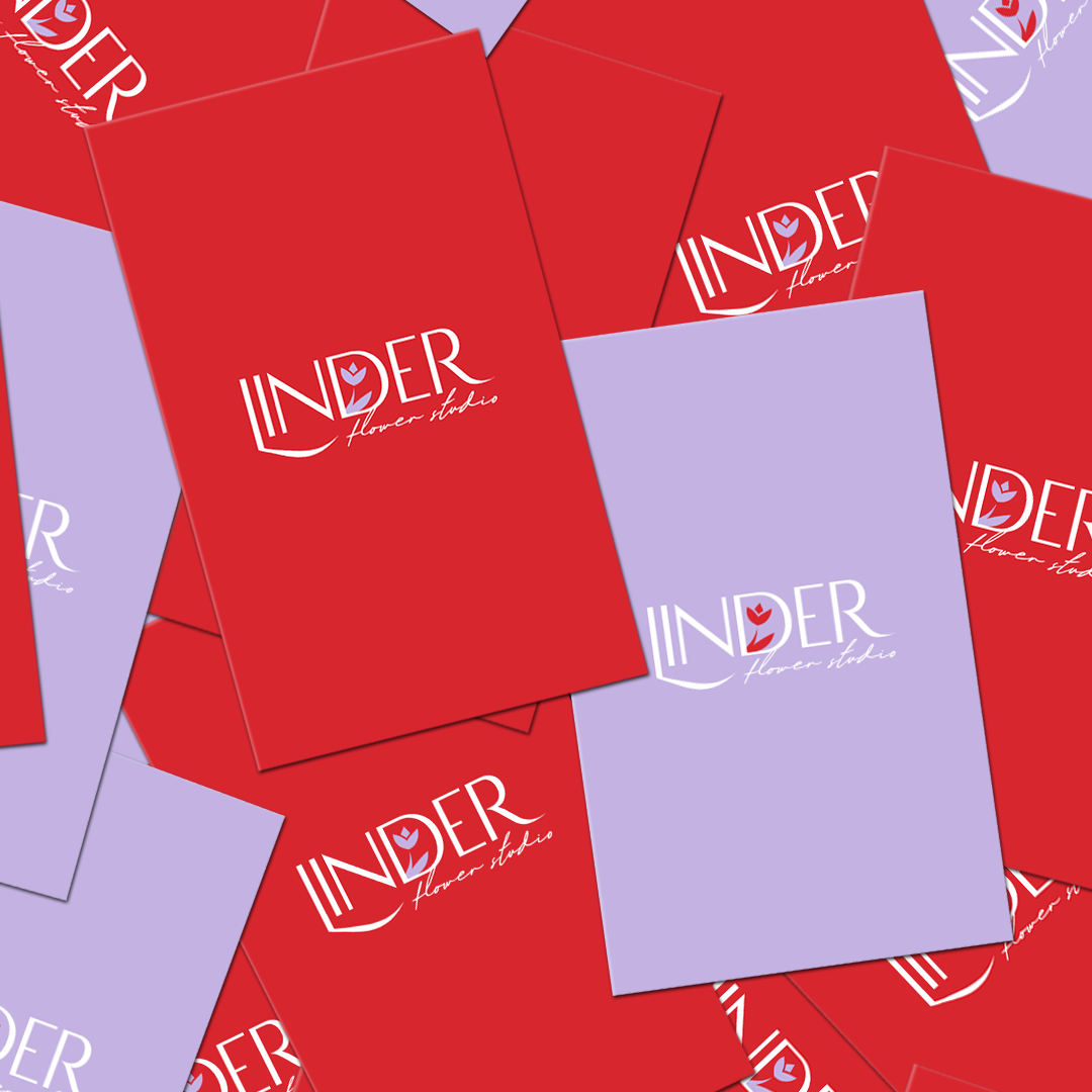
Brand identity for a flower studio that specializes in event decoration and floral interiors, photography with a floral focus, holiday printing design, and bouquet arrangement.
The logo is designed in a minimalist style that aligns with the theme, featuring subtle elegant lines of the font combined with decorative script for the descriptor (description) as a recognition of the field in the creative direction. The graphic design hints at the direct interaction of the brand with flowers.
As for the color palette: contrasting colors are used in character – bright red combined with a delicate shade of purple, which speaks to the uniqueness of the business sphere, whose services will be needed and relevant for everyone.