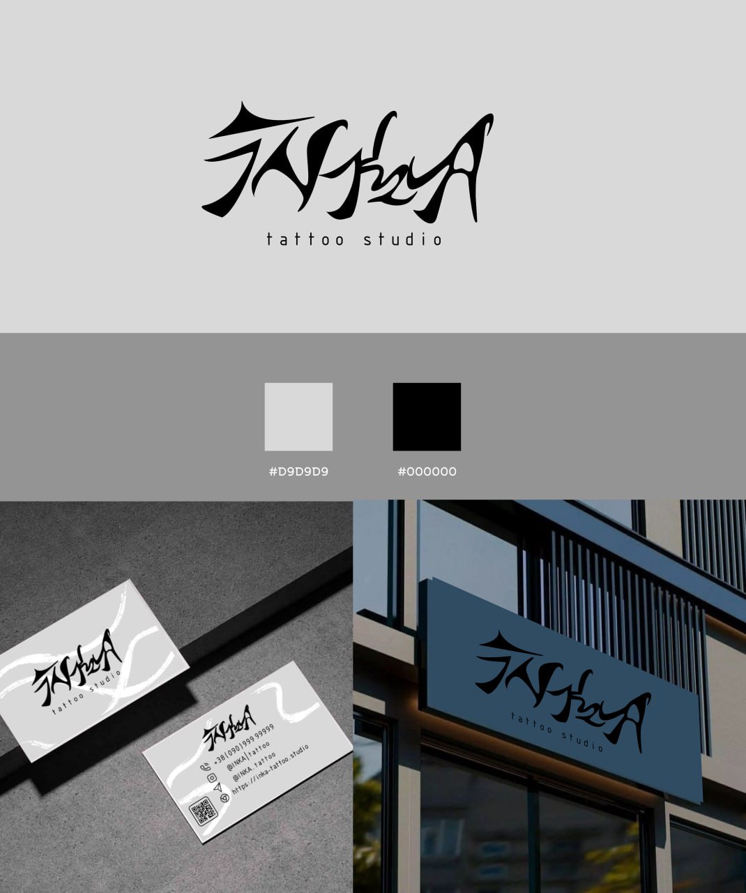
Minimalistic yet expressive branding that conveys the atmosphere of tattoo art and the individuality of the studio. The main focus is on the unique calligraphic form of the logo, which combines artistic style and modern presentation.
What has been done:
• Development of an original font logo in a calligraphy style.
• Selection of a concise black-gray palette (#D9D9D9, #000000) that emphasizes contrast and professionalism.
• Design of business cards with an integrated QR code.
• Visualization of the logo on the studio facade.
Result: The identity turned out to be stylish, modern, and recognizable. It highlights the studio's creative approach and its focus on the uniqueness of each client.