Justicum Law Firm
Logo Design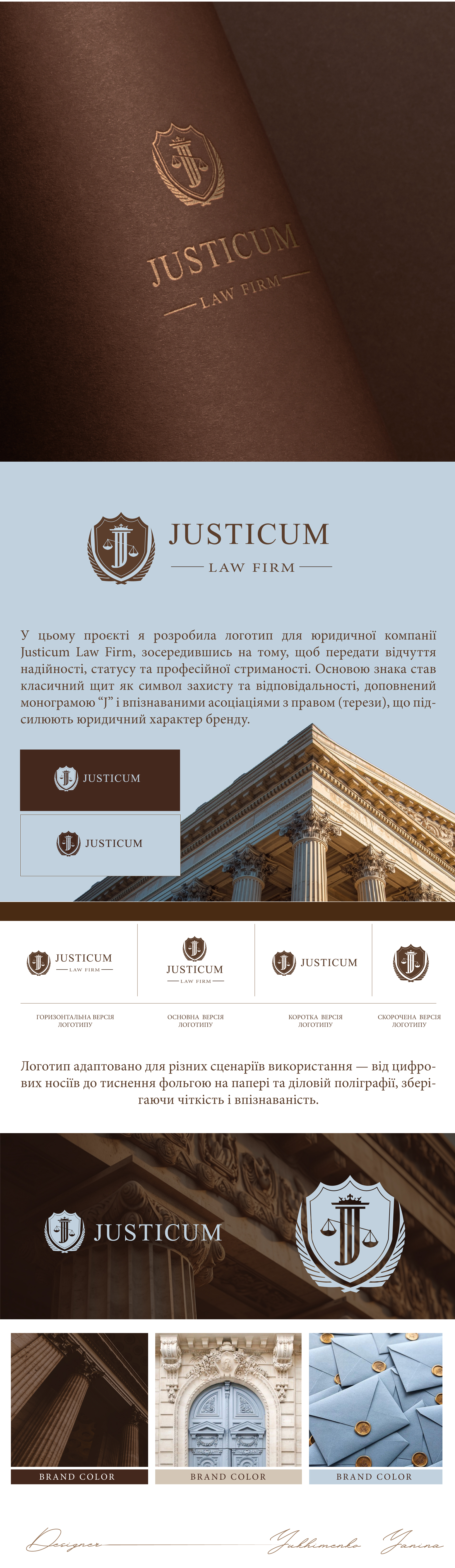
In this project, I developed a logo for the law firm Justicum Law Firm, focusing on conveying a sense of reliability, status, and professional restraint.
The foundation of the mark is a classic shield as a symbol of protection and responsibility, complemented by the monogram "J" and recognizable associations with law (scales), which enhance the legal character of the brand. The typography is selected in a restrained classic manner to support a premium image and readability at any scale.
The logo is adapted for various usage scenarios — from digital media to foil stamping on paper and business printing, maintaining clarity and recognizability.
As a result, a concise yet expressive identity was created that builds trust and emphasizes the company's expertise.