The Kettle Site
Web Design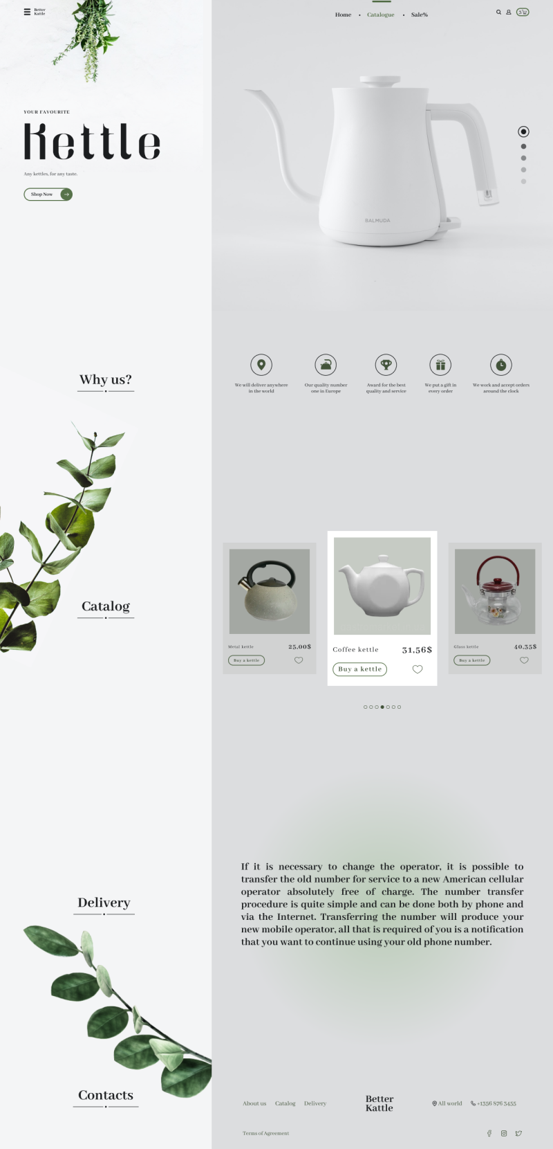
In this work I wanted to play on the contrast of chromatic and ahromatic colors. I also thought it was nice and stylish to add a bit of botanics and as the teaspoons that are sold on this site are made of quality and without harm to human health, so botanics just has the appropriate theme. And the main color is dark-green, one of the shades of the used botanics.
#Web design #website #contracts
#Web design #website #contracts