Label "Odesa Sea Lemonade"
Packaging and label design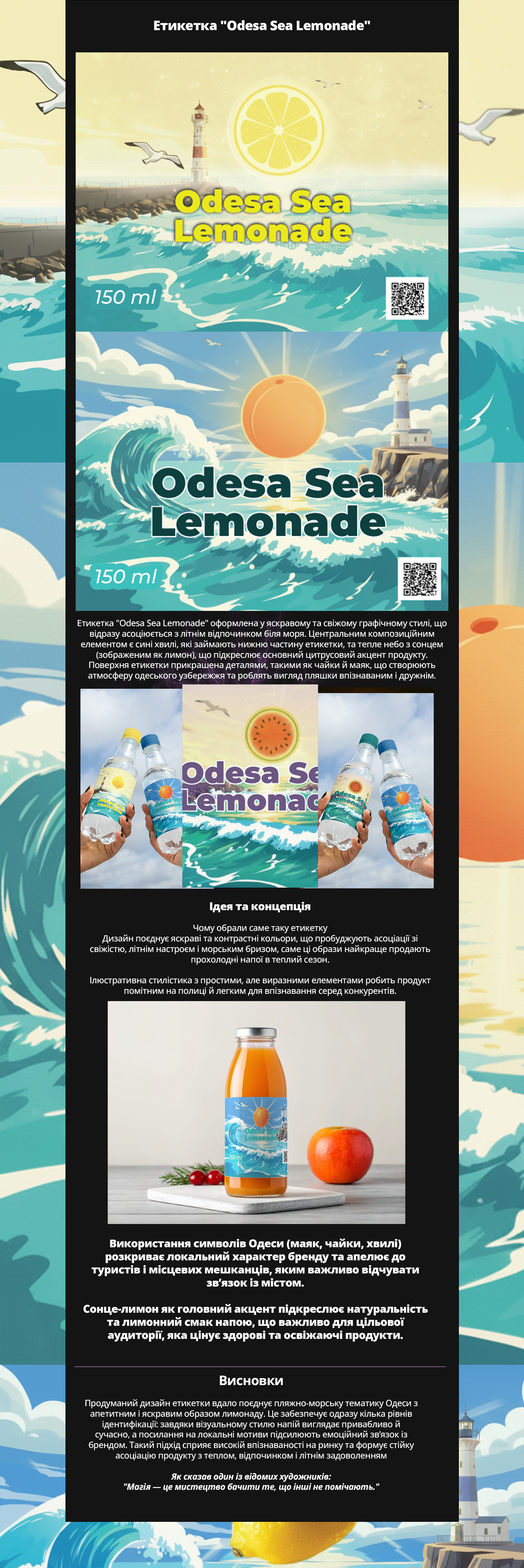
The label "Odesa Sea Lemonade" is designed in a bright and fresh graphic style that immediately evokes associations with summer vacations by the sea. The central compositional element is blue waves that occupy the lower part of the label, and a warm sky with the sun (depicted as a lemon), which emphasizes the main citrus accent of the product. The surface of the label is adorned with details such as seagulls and a lighthouse, creating an atmosphere of the Odesa coastline and making the bottle's appearance recognizable and friendly.
Why this label was chosen
The design combines bright and contrasting colors that awaken associations with freshness, a summer mood, and sea breeze; these images best sell cool drinks in the warm season.
The illustrative style with simple yet expressive elements makes the product noticeable on the shelf and easy to recognize among competitors.
The use of symbols of Odesa (lighthouse, seagulls, waves) reveals the local character of the brand and appeals to tourists and locals who value a connection to the city.
The sun-lemon as the main accent emphasizes the naturalness and lemon flavor of the drink, which is important for the target audience that appreciates healthy and refreshing products.
Conclusions
The thoughtful label design successfully combines the beach-sea theme of Odesa with the appetizing and bright image of lemonade. This provides several levels of identification: thanks to the visual style, the drink looks attractive and modern, while references to local motifs enhance the emotional connection with the brand. This approach contributes to high market recognition and forms a lasting association of the product with warmth, relaxation, and summer enjoyment.