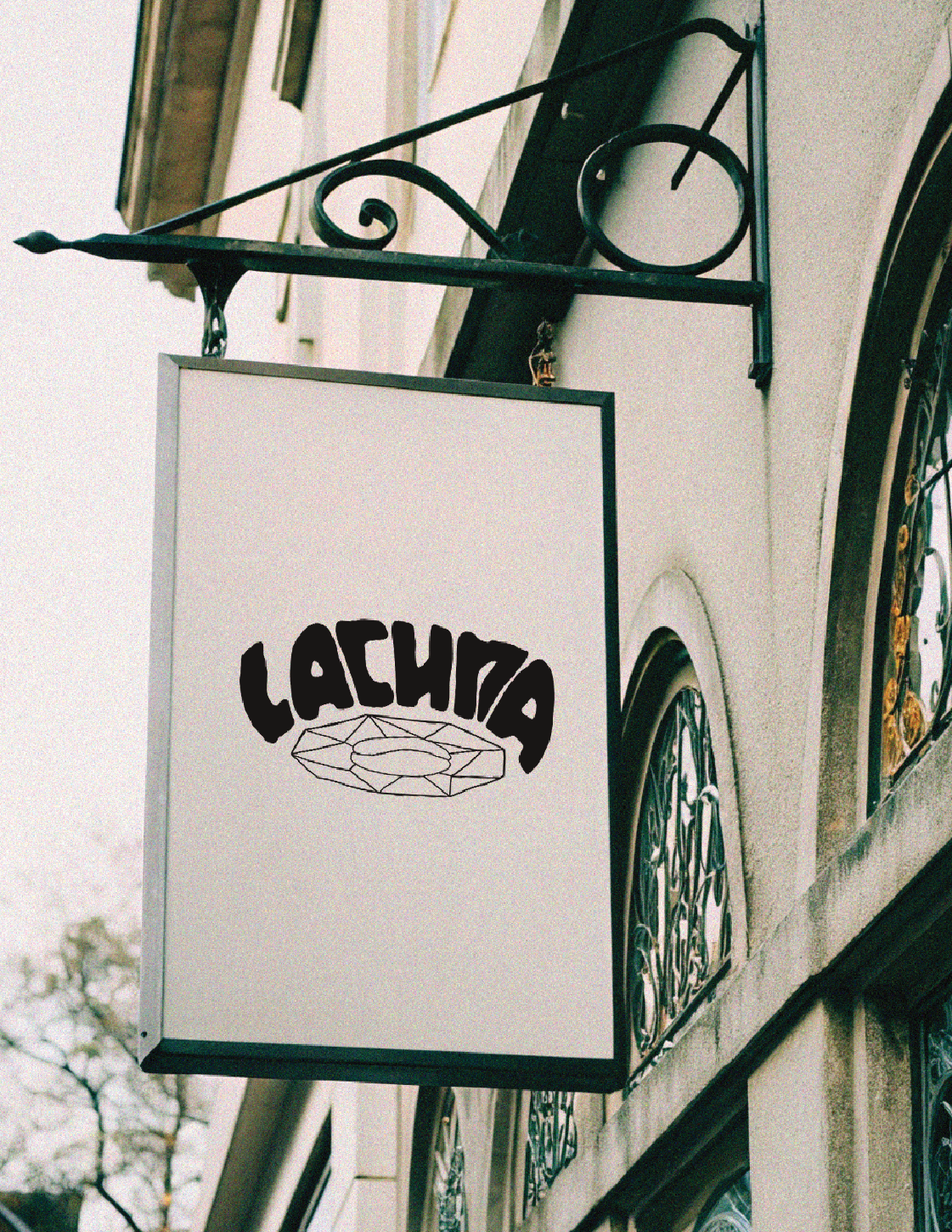
Lacuna Logo — is a visual reflection of the coffee shop itself.
At its core — the structure of stained glass: uneven, lively lines, as if drawn by hand. They are not perfect, but in this their warmth and character lie — like in the space itself, where atmosphere matters more than form.
The typography is intentionally fragile: the letters seem cut out of old glass. They vibrate, refract light, creating a sense of silence and light irrationality.
Inside the sign, there is a nearly invisible coffee bean — it is this that connects the logo with the mascot and turns their interaction into a small but tangible brand ritual.