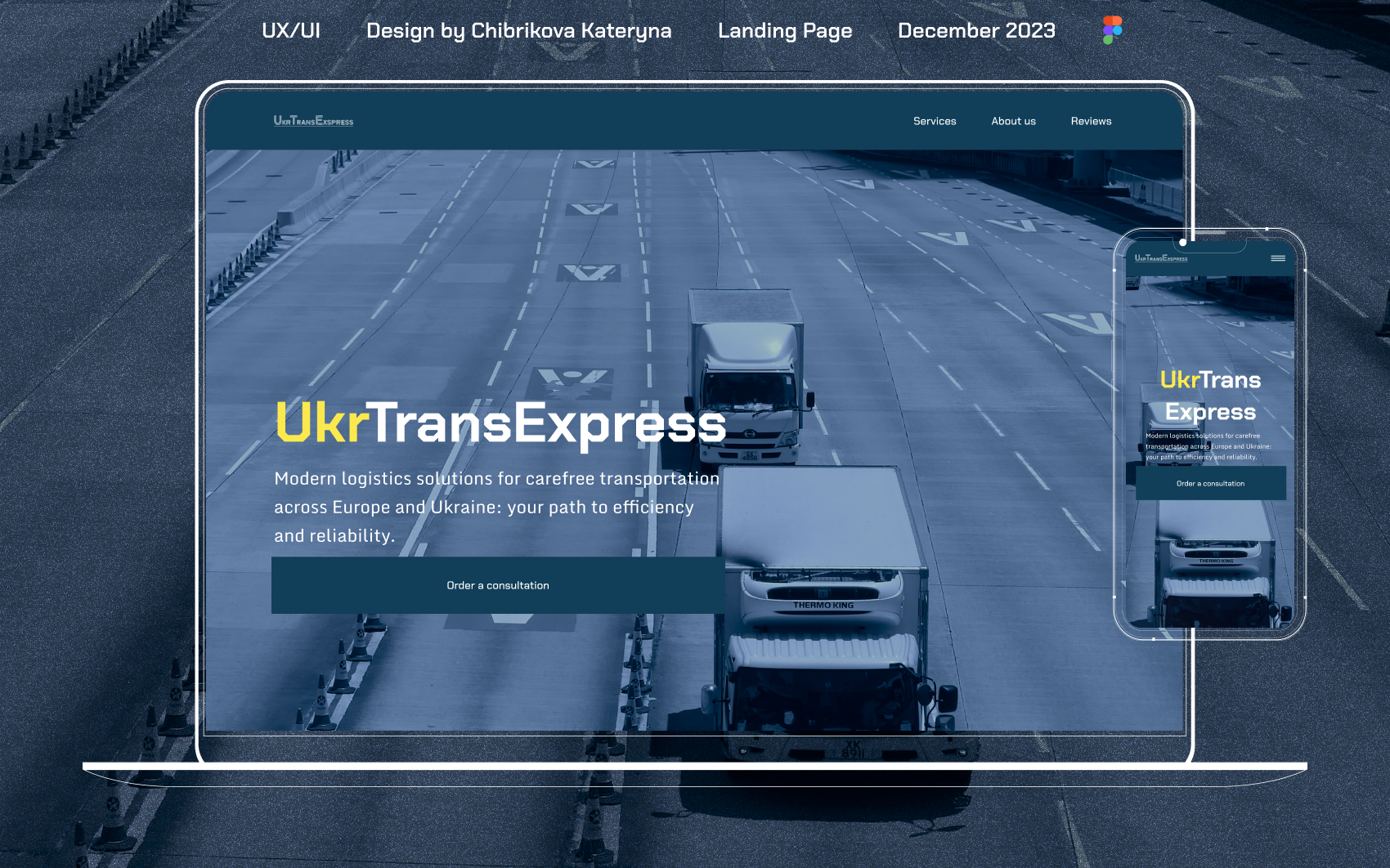
The purpose of the design was:
#To attract the attention of new clients.
#To create a clear and intuitively understandable structure, hierarchy, and navigation.
#To add the ability to leave a request for consultation.
#To allow users to independently familiarize themselves with all the information that is interesting to them.
#To use the company's color palette.
#To achieve these goals, the following improvements were made:
1. Attracting the attention of new clients
Visual elements: Bright and attention-grabbing elements such as banners, slideshows, and animations were added. High-quality images demonstrating products or services were used.
Calls to action (CTA): Visible and persuasive call-to-action buttons were placed, standing out on the background and easily noticeable.
2. Clear and intuitively understandable structure, hierarchy, and navigation
Navigation menu: The navigation menu was logically structured and easily accessible. Main sections were immediately visible, submenus were logically organized.
Content hierarchy: Headings of different levels (H1, H2, H3) were used to create a clear hierarchy of information. Content was divided into small blocks for users to quickly find the necessary information.
3. Ability to leave a request for consultation
Request form: The consultation request form was placed prominently, for example, on the homepage or in the top part of the sidebar. The form was simple and not overloaded with questions.
4. Ability to independently familiarize with all the interesting information
Information pages: Detailed pages with information about products and services were provided. These pages were easily accessible through the navigation menu or links on the homepage.
5. Use of the company's color palette
Design coherence: The color palette used corresponded to the company's brand. Brand colors were used for key elements such as headings, buttons, and important visual elements.
Contrast and readability: Text and backgrounds were checked to ensure sufficient contrast, providing good readability.