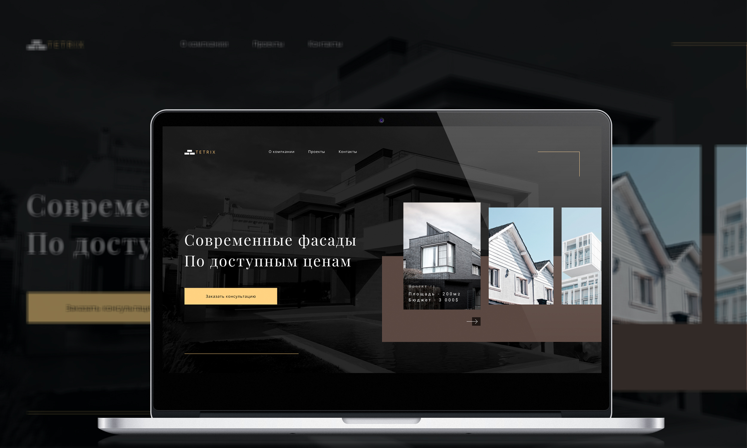
Landing in the style of minimalism for the company to build facades at home
Purpose: bring the customer to the order of consultation
Three stages of achieving the goal: Achieving the goal: Step-by-step information about the company
1) Short entry so that the visitor of the site understands that he needs it.For this purpose, the maps with the projects made and the prices on them were used.Connection button and additional categories in the hat
2) Information about the company, allowing you to present the level of specialization and training in this direction
3) the right to leave the application or to make a call with any question arising
UX and UI elements were used to create this banding.UX - quick and understandable access to the action buttons, understandable orientation across all the banding blocks, directing elements for application or viewing additional information.UI is a color range that focuses attention on the main information.Strict but quiet colors that do not keep the eyes in tension.The colors for the buttons are selected so that the visitor can find them without trouble.Plus to the project + was created a logo and two options of banners for placing advertising in the Internet spaces.#design #web design #UX-Designer #landing #ux/ui #UI-Designer #website #website #visit card #figma #ux #ui #landingpage