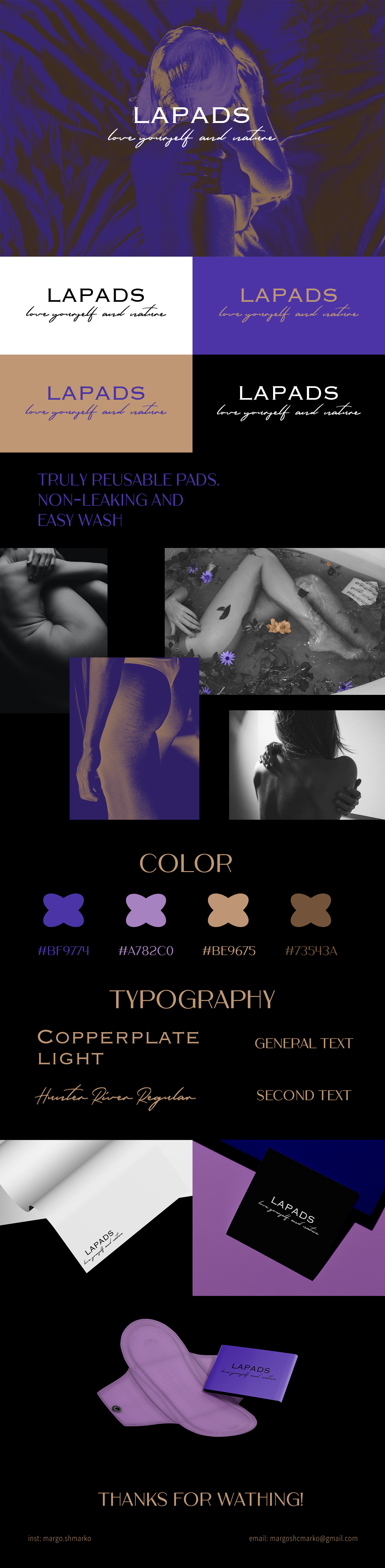
The LAPADS. Logo Design
task: development of a font logo for a small business producing reusable pads, based on the wishes of the client, I created this logo
Goal: to reflect femininity and natural strength of a woman at the same time.
the chosen colors are associatively reminiscent of skin tones, and purple colors show femininity and tenderness.
The LAPADS. Design of Logos
task: developing a font logo for a small business with the production of multi-plate, out of the customer’s desire, I created this logo
The aim is to reflect the femininity and natural strength of a woman at the same time.
The color selected associatively resembles the shades of the skin, and the white colors show femininity and delicacy.