Layout of the admin panel for responsive design for PC and mobile version
HTML & CSS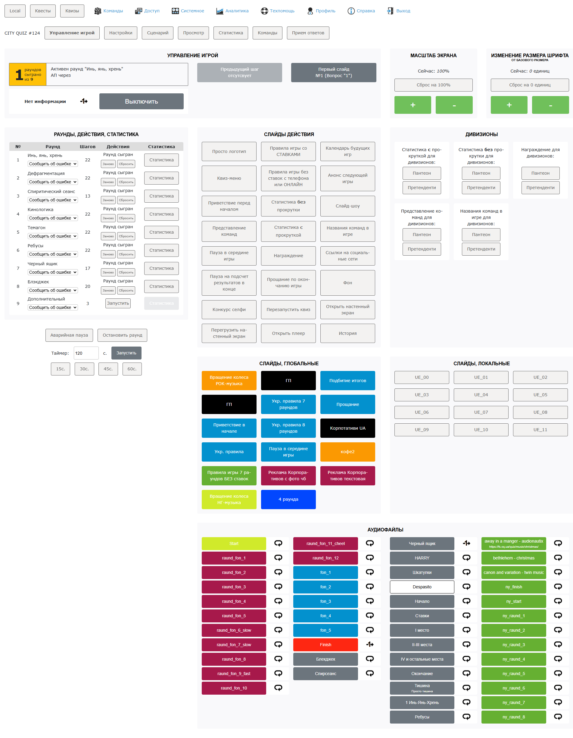
Project: Admin panel layout for web application
- Type of work: Frontend development, layout
- Technologies: HTML5, CSS3
- Responsiveness: Fluid design (Desktop + Mobile)
Flexible grid: Flexbox
Project description
The admin panel is designed for convenient content management of the web application. The main goal is to create a responsive and user-friendly UI that will be comfortable to work with on both PCs and mobile devices.
Main tasks
- Development of a responsive grid – Flexbox is used for convenient scaling of the interface.
- Layout of components – navigation panel, tables, cards, forms, buttons.
- Optimization for mobile devices – media queries and flexible layout are used to ensure the interface displays correctly on screens from 320px.
Responsiveness
PC (1200px+): full-screen interface, multi-column grid.
Tablets (768px - 1199px): optimized tables and navigation.
Mobile (320px - 767px): burger menu, vertical display of blocks, simplified tables.
- Conclusion
This project demonstrated knowledge of modern approaches in layout and the creation of responsive UI. As a result, a flexible, user-friendly, and fast admin panel was created that works correctly on all devices.