Limited edition winter cups for the ISOLA coffee shop
Packaging and label design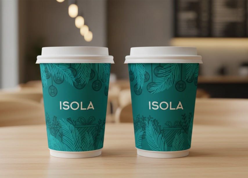
Task: Develop a design for festive packaging that stands out among competitors and does not use clichés (Santa Claus, red color). It was necessary to create a stylish, modern image that emphasizes the premium nature of the establishment.
Solution: I chose a modern minimalist style using line art.
Color: The brand's signature deep turquoise color was used as the base. This allowed for a departure from the standard red-green Christmas palette, maintaining 100% recognition of the café and adding nobility to the design.
Graphics: A unique pattern of contour illustrations was created: a combination of winter attributes (Christmas tree decorations, gifts) with elegant botanical motifs.
Typography: A concise logo was harmoniously integrated into the composition, preserving "air" in the design.
Technical implementation: The layout was developed considering the conical deformation of the cup (to keep the lines straight) and prepared for printing with Pantone colors for perfect reproduction of the brand color.