Task:
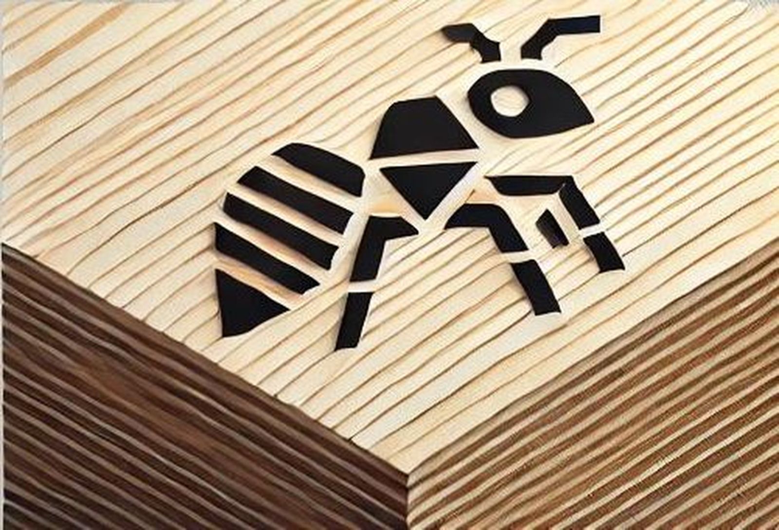
The logo of the company ABC, which sells birch plywood, reflects the key values of the brand: reliability, natural aesthetics, and technological sophistication.
The design is based on a stylized ant, symbolizing hard work, teamwork, and strength, which resonates with the qualities of birch plywood. Its shape is executed in a minimalist and geometric style, with elements reminiscent of layers of plywood, emphasizing the multilayer structure and natural origin of the product.
The font of the logo is modern, strict, yet with soft forms, reflecting a balance between technology and natural material. The color scheme is predominantly monochrome (black, gray, white) with possible accents in wood tones, highlighting the eco-friendliness and naturalness of the product.
This logo creates a clean, professional, and recognizable image of a company that offers high-quality birch plywood for various industries – from construction to furniture manufacturing.
*********************************
Idea:
An abstract symbol of an ant, composed of geometric elements (circles, lines, angles), reminiscent of layers of plywood.
The body of the ant is represented by a three-layer structure, with slight displacements creating a multilayer effect.
The head and antennas are executed in a minimalist, linear style, maintaining a strict, technological appearance.
Additional element:
Under the ant, there may be a stylized wood texture in the form of horizontal stripes, hinting at the wood layers of plywood.
Colors:
Monochrome black-gray variant — strict and technological.
Accent in wood color (for example, the ant is black, and its outline is a warm wood tone).
Overall concept
This variant emphasizes the core values of company ABC — reliability, naturalness, and technological sophistication. The ant symbolizes hard work and strength, while the multilayer structure visually resembles layers of plywood.