Logo design for a beauty studio
Logo Design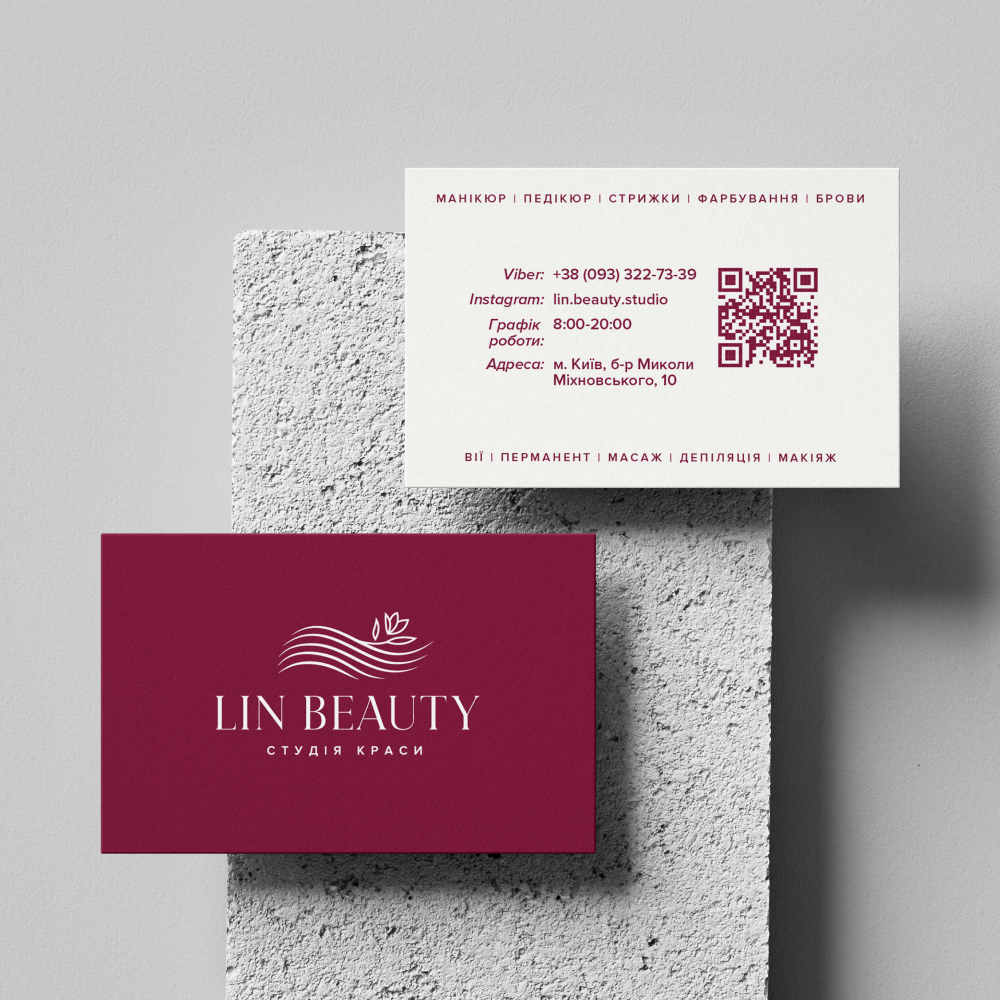
The logo was developed as part of a redesign for a beauty studio focused on the premium segment. The design combines an elegant serif font with a graphic element in the form of smooth lines reminiscent of a hair silhouette, complemented by leaves as a symbol of naturalness and care.
The color palette features a rich burgundy background, highlighting the sophistication and professionalism of the brand. The minimalist style and thoughtful composition ensure good readability and adaptability of the logo across various media.
The color palette features a rich burgundy background, highlighting the sophistication and professionalism of the brand. The minimalist style and thoughtful composition ensure good readability and adaptability of the logo across various media.