Logotype for Yoga Center “Kiran”
The task:
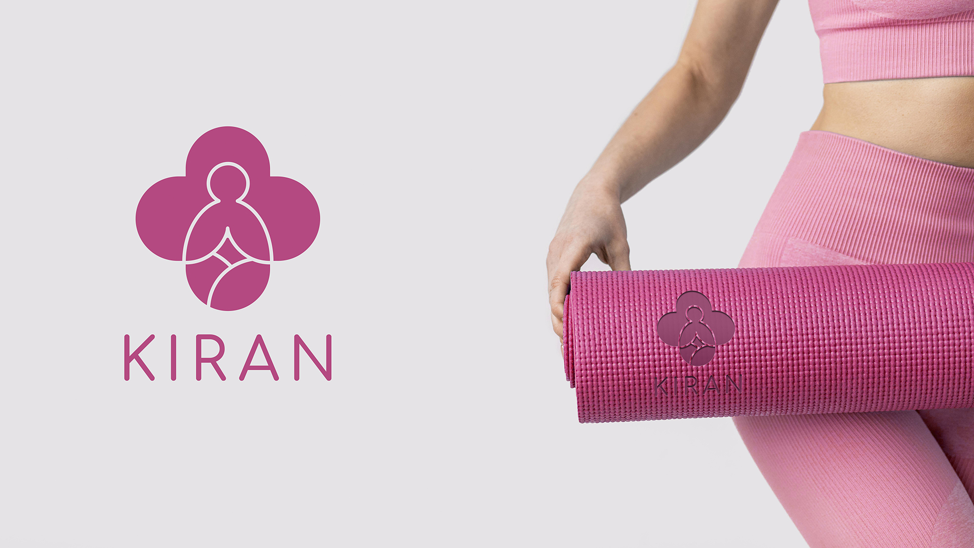
• Develop a complete, monolithic logo.• The logotype should cause association with medicine.The Decision:
It was decided to use the red cross, then strongly smooth the corners, because.Women’s audience is founded.Likewise, in the figure of the cross, which strongly resembles a flower, a figure of a person consisting of lines was placed.The person is in a meditating state.Thus, through the logo it was possible to transmit care and softness for the sake of smooth lines and the figures we know.The font:
A soft, thin font was chosen.In combination with the sign, the font and the sign are perfectly contrasted in mass and shape.Color: pink in several shades.T K .The main audience is women, it was decided to choose a deep, calming pink color.#Yoga #branding #logo #design #firmennystyle #health #branding #marking #logotypes #brand #healing #identity #logodesign #style #movement #medicine #marketing #positioning #presentation #tm #mark #roze #franchise
The task:
• Develop a complete, monolithic logo.• The logotype should cause association with medicine.The Decision:
It was decided to use the red cross, then strongly smooth the corners, because.Women’s audience is founded.Likewise, in the figure of the cross, which strongly resembles a flower, a figure of a person consisting of lines was placed.The person is in a meditating state.Thus, through the logo it was possible to transmit care and softness for the sake of smooth lines and the figures we know.The font:
A soft, thin font was chosen.In combination with the sign, the font and the sign are perfectly contrasted in mass and shape.Color: pink in several shades.T K .The main audience is women, it was decided to choose a deep, calming pink color.#Yoga #branding #logo #design #firmennystyle #health #branding #marking #logotypes #brand #healing #identity #logodesign #style #movement #medicine #marketing #positioning #presentation #tm #mark #roze #franchise