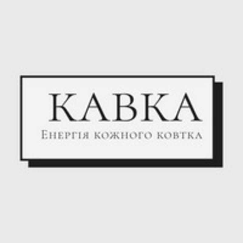
Brand name — "KAVKA"
The client wanted a clear, concise name that is easy to remember.
In uppercase letters, possibly to emphasize the strength, reliability, or energy of the brand.
Slogan — "Energy in Every Sip"
This indicates a product related to beverages (probably coffee or energy drinks).
The client wanted to convey the idea of recharging, alertness, activity.
Style and color scheme
Minimalist design (black and white style), creating an elegant and modern impression.
Perhaps the client aimed to create a premium or "intellectual" brand image.
Font
Refined, classic font indicating a desire to look stylish and professional.
Maybe the client wanted to avoid bright, youthful styles in favor of a more mature brand.
Composition
A frame around the logo with a shadow creates a sense of structure, order, and completeness.
Likely client preferences:
Restraint and elegance in design.
Focus on energy and product quality.
Conciseness without unnecessary decorative elements.
Versatility — the logo should look good both on packaging and in digital formats.