Development of a corporate style for a premium nail care brand. The logo combines modernity with the elegance of the beauty industry.
Conceptual solution:
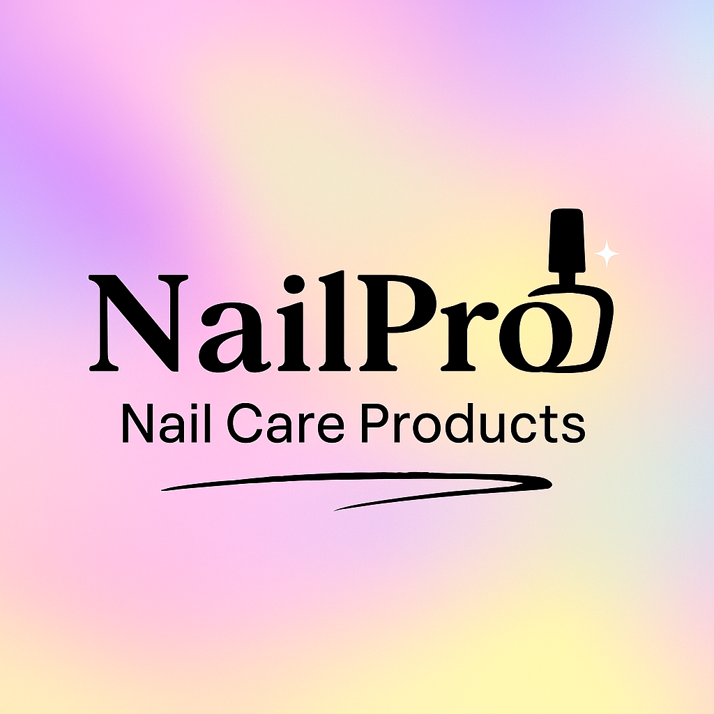
The name "NailPro" emphasizes the professional level of the products, and the nail polish element integrated directly into the letter "o" creates an instant association with the brand.
Color palette:
A gradient from soft pink to gold reflects femininity and luxury. The color transition symbolizes the variety of shades of the brand's products.
Typography solution:
The chosen antique with soft rounded shapes creates a sense of accessibility and friendliness of the brand. The contrast in thicknesses emphasizes a modern character.
Application:
The logo is optimized for use on packaging, in digital environments, and BTL materials. The gradient variability allows adaptation to different media.
Conceptual solution:
The name "NailPro" emphasizes the professional level of the products, and the nail polish element integrated directly into the letter "o" creates an instant association with the brand.
Color palette:
A gradient from soft pink to gold reflects femininity and luxury. The color transition symbolizes the variety of shades of the brand's products.
Typography solution:
The chosen antique with soft rounded shapes creates a sense of accessibility and friendliness of the brand. The contrast in thicknesses emphasizes a modern character.
Application:
The logo is optimized for use on packaging, in digital environments, and BTL materials. The gradient variability allows adaptation to different media.