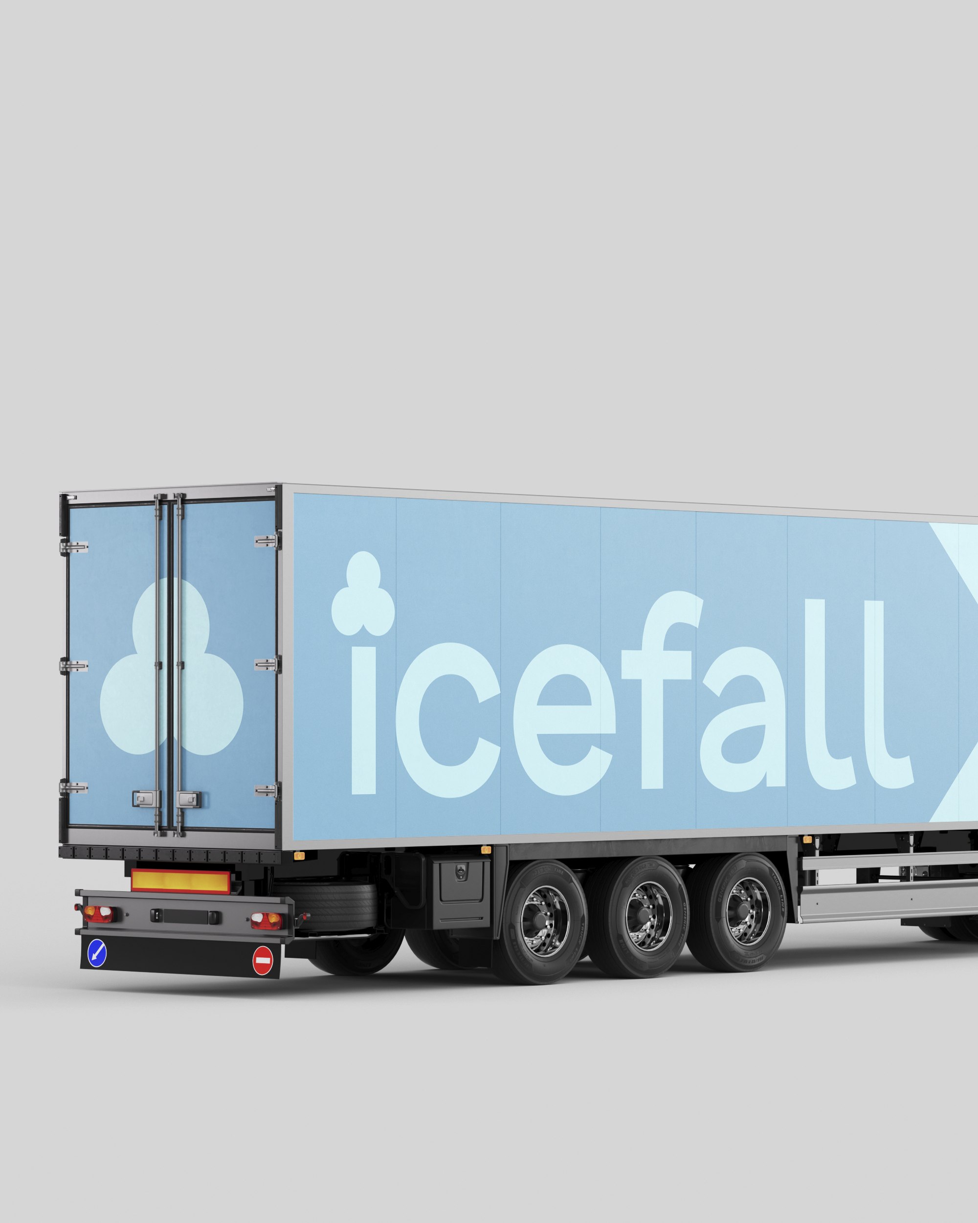
"ICEFALL" is a manufacturer of craft ice cream. For logos in this industry, the main requirement is readability and recognizability from any distance and size. Therefore, during the development of the logo, the task arose to invent a minimalist yet recognizable symbol that also has meaning.
In our logo, this meaning is easily read. It is enough to look at the letter "i," where instead of a dot at the top, there are three ice cream scoops. Moreover, the modernity of the logo is enhanced by a contemporary, slightly informal font.
The color palette deserves special attention. Since the logo will eventually be placed on packaging of various colors (as well as in advertising, social media, etc.), it was decided to create three main versions in which the background and the text harmonize well.