The main task was to create a modern, concise, and at the same time cozy logo for a children's toy brand that would evoke pleasant emotions in parents and be easily memorable for children.
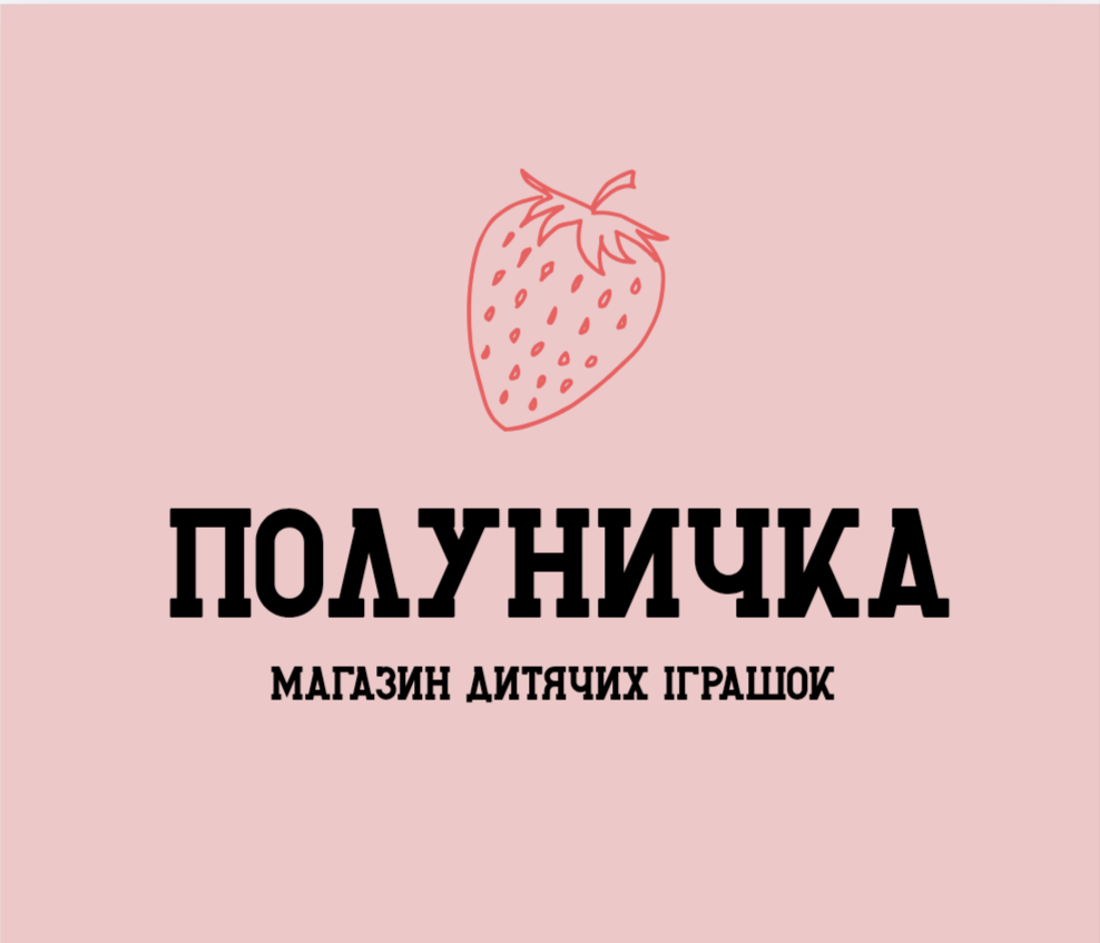
The visual concept is based on a minimalist line drawing of a strawberry. The light outline makes the sign universal for use on any medium: from an Instagram avatar to branded bags, stickers, or tags on toys.
The color palette consists of a soft pastel pink background and a coral-red accent for the graphic element. This combination symbolizes childhood, warmth, care, and joy.
For the name "POLUNICHKA," a bold, clear font with expressive serifs was chosen, making the brand noticeable and recognizable. The descriptor "CHILDREN'S TOY STORE" is done in a simpler style, ensuring that the text remains legible and easy to read even at a very small scale.
As a result, a stylish brand mark was created that effectively fulfills the marketing tasks of the business and distinguishes the store from competitors.
Skills: Graphic Design, Logos, Branding.
Tools: Canva.