Logo for the beauty service "Nails by Hanna"
Logo Design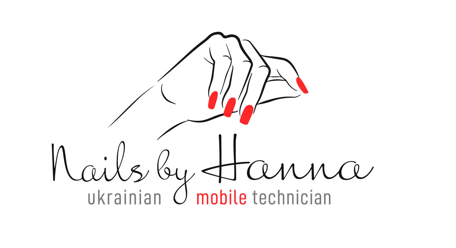
A logo has been developed for a mobile nail master.
The task is to create a light, feminine, and recognizable logo that emphasizes the beauty service direction and looks good both online and on printed materials.
The design includes:
a linear illustration of a hand as a direct association with the nail sphere
minimalist graphics
an accent color to highlight details
a combination of handwritten and simple fonts for a personal style
The logo is adapted for use on social media, business cards, price lists, and promotional materials.