Logo and firm style for catering "Orange Olive"
The company provides the services of exit fursets and weddings, coffee breaks, bankets, BBQ, Swedish tables.
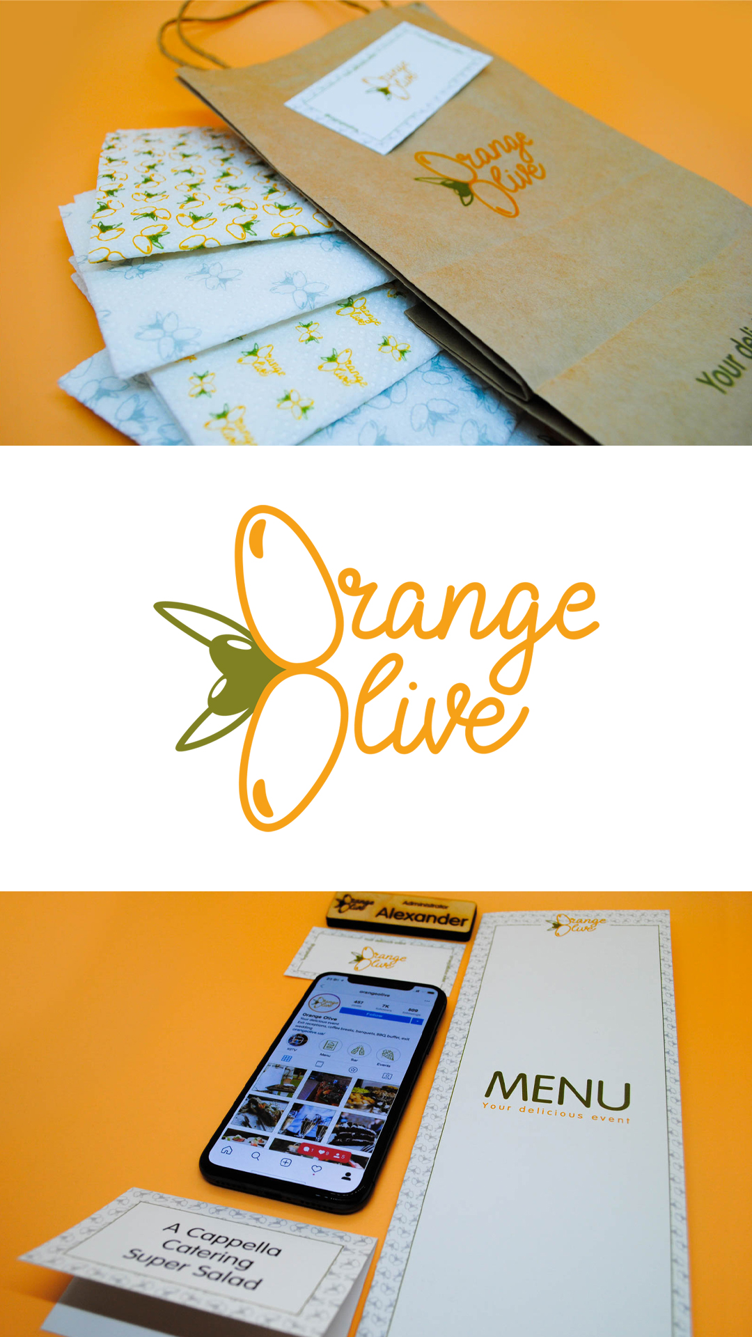
The logo is made in two colors - olive and mandarin. Two letters "O" are styled under olives on the branch and are intended to be made in orange color, which further emphasizes the company's name. The name itself is handwritten, which symbolizes the manual work in which the soul is placed. Because the company does everything by itself - guest service, table service, cooking and food delivery.
In the framework of the firm style, patterns have been developed. They were the further foundation for the menu, visitor cards, paper packages and glasses, salphets, the layout of the instagram and tables for the names of dishes. Stickers and wooden beige were also made.
The company provides the services of exit fursets and weddings, coffee breaks, bankets, BBQ, Swedish tables.
The logo is made in two colors - olive and mandarin. Two letters "O" are styled under olives on the branch and are intended to be made in orange color, which further emphasizes the company's name. The name itself is handwritten, which symbolizes the manual work in which the soul is placed. Because the company does everything by itself - guest service, table service, cooking and food delivery.
In the framework of the firm style, patterns have been developed. They were the further foundation for the menu, visitor cards, paper packages and glasses, salphets, the layout of the instagram and tables for the names of dishes. Stickers and wooden beige were also made.