Logo for a cosmetics brand
Logo Design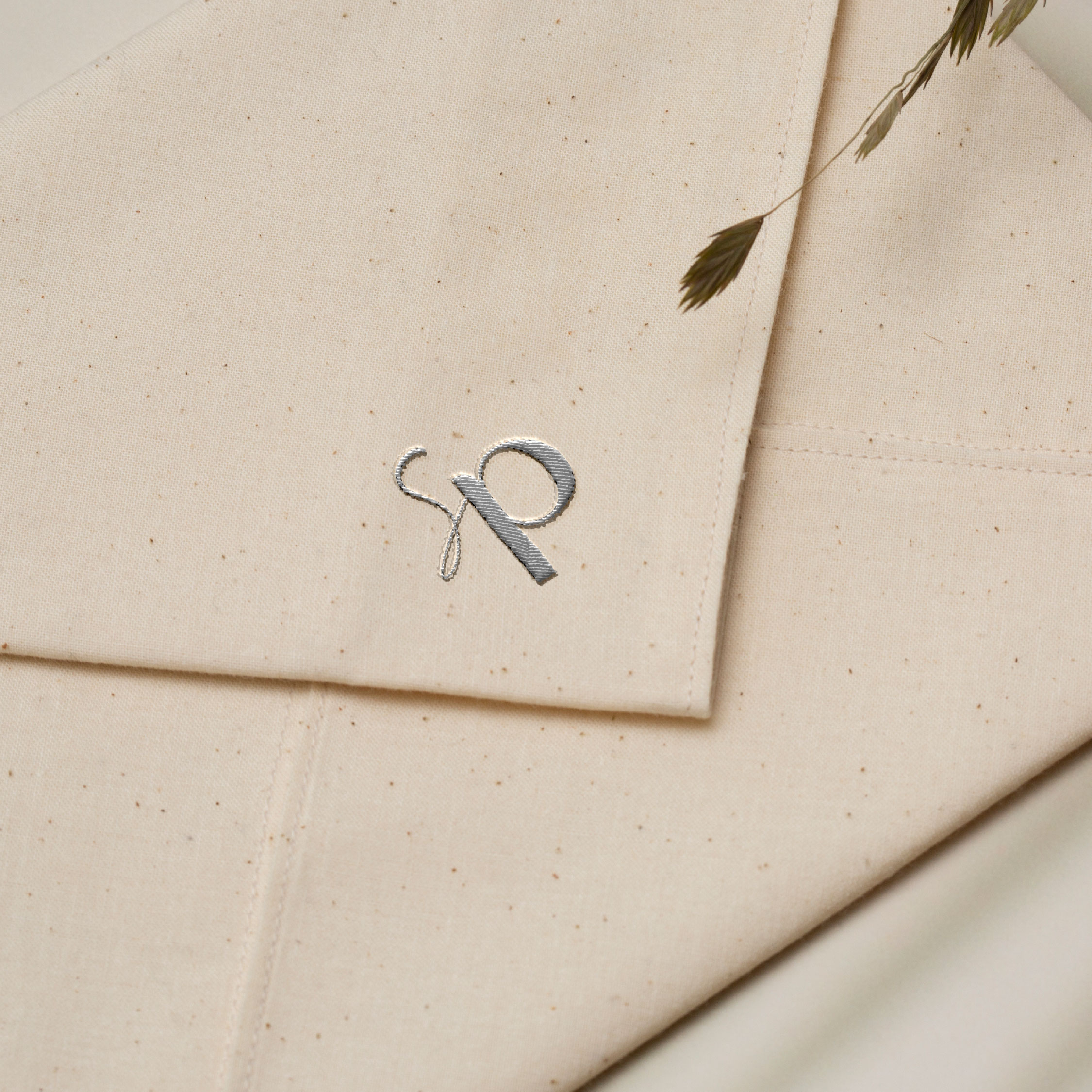
Logo for the brand of daily decorative cosmetics for makeup - SkinPoem. The main task was to create a logo that conveys an image of lightness, tenderness, confidence, and care.
For the logo concept, I chose a typographic solution: a font in a minimalist modern style without serifs, which I combined with a handwritten style. The contrast between these two fonts creates visual balance and makes the logo light and recognizable.
A key element is also the monogram sign "sp," executed in a smooth, gentle style. The lines of the sign symbolize a soft touch and natural beauty - exactly the feeling that the brand wants to convey through its products.
For the brand palette, I used a combination of lavender, deep graphite, and warm beige. These shades are associated with sophistication, care, and the aesthetics of feminine beauty, which is perfect for a decorative cosmetics brand.
As a result, the logo turned out to be gentle, stylish, and feminine. It scales well and will look organic on packaging, social media, and advertising materials. The monogram easily forms the basis of the identity and allows for the creation of a cohesive, harmonious visual style for the brand.
You can view the work here: https://www.instagram.com/p/DRINgLjAOnA/?img_index=1