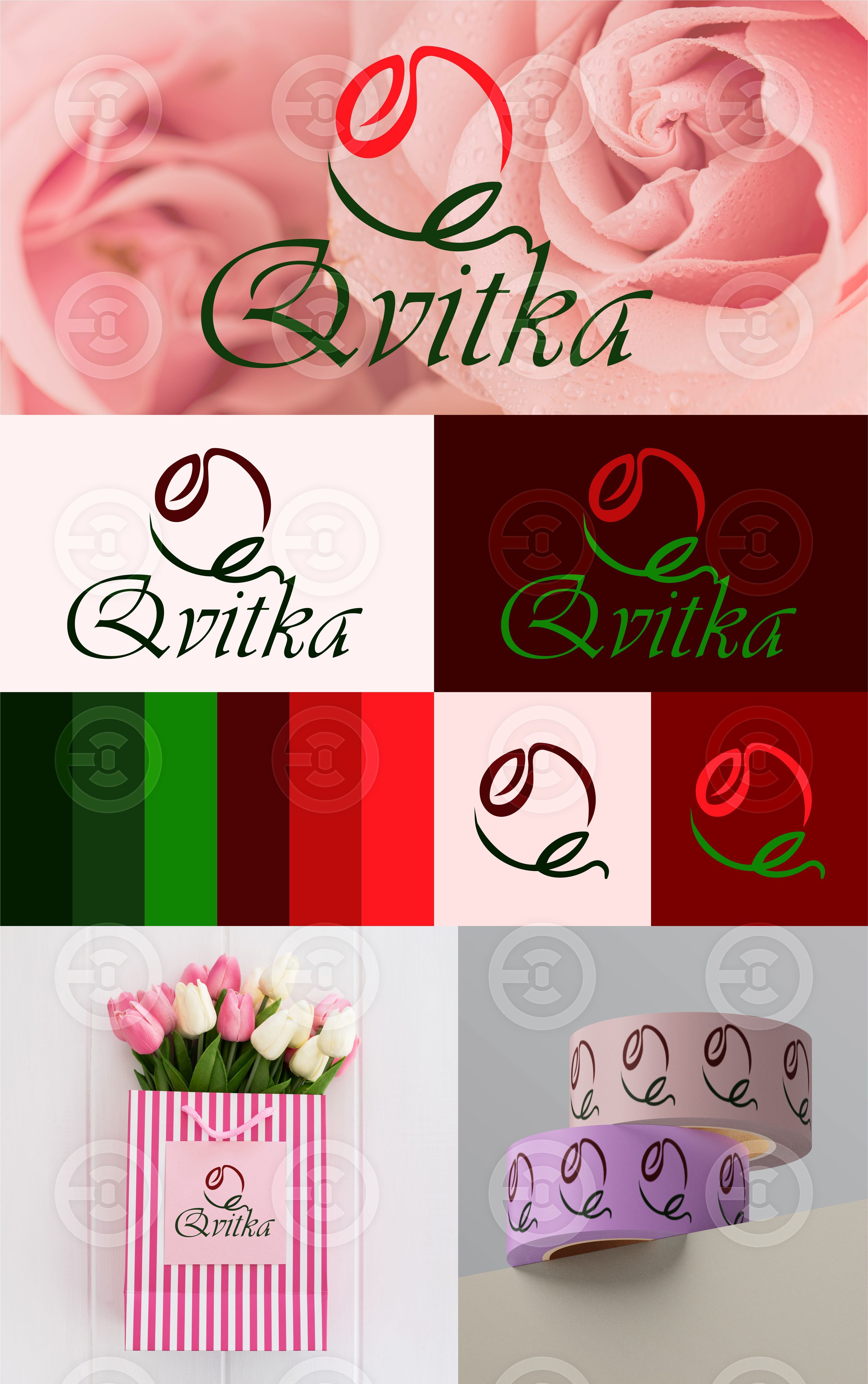
The basis of the graphic sign concept is an image of a rose, which is assembled into the initial letter of the company name Q. The sign is positioned in such a way that it creates the impression that it is one with the name, smoothly flowing into it.