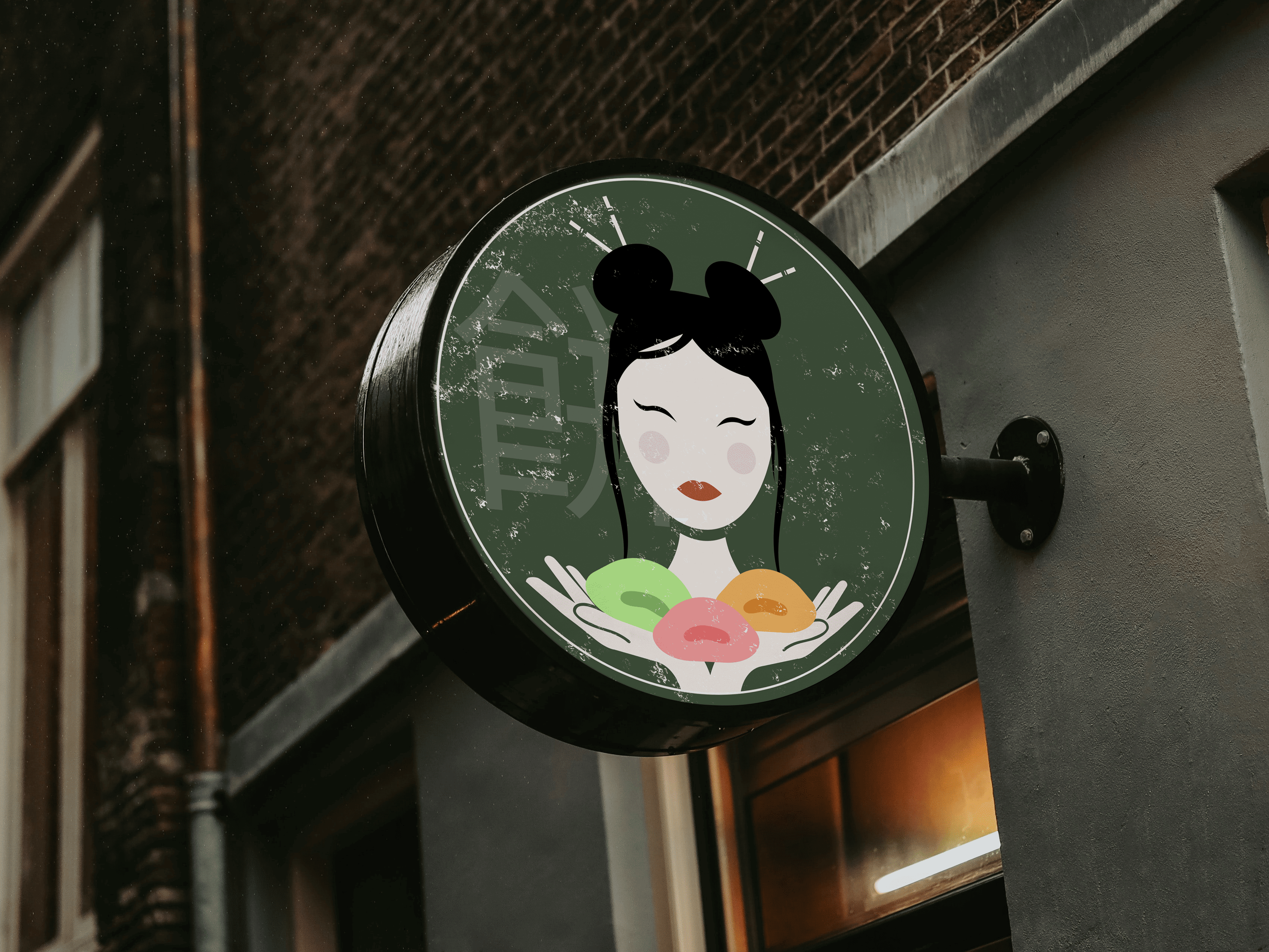
Development of a logo for a Japanese café specializing in traditional mochi and desserts. The main idea is to combine the minimalism of Japanese culture with a friendly, warm emotion of street food format.
The central image is a stylized female character in Japanese aesthetics, symbolizing care, traditions, and handmade craftsmanship. Colorful mochi in her hands create a bright accent and immediately convey the essence of the product, making the logo recognizable and "tasty" at first glance.
The central image is a stylized female character in Japanese aesthetics, symbolizing care, traditions, and handmade craftsmanship. Colorful mochi in her hands create a bright accent and immediately convey the essence of the product, making the logo recognizable and "tasty" at first glance.