The project is created for a brand in the field of pilates, which combines the aesthetics of movement, strength, and inner harmony.
Main task:
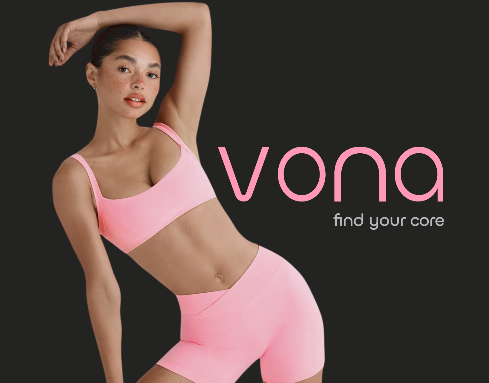
Develop a logo that reflects modernity, femininity, and clear positioning of the studio, that strength is in movement.
Solution:
- Minimalist font with soft, rounded shapes — conveys flexibility and smoothness of movements.
- Pink palette — emphasizes lightness, care, and openness of the brand.
The logo is well scalable and looks harmonious both in digital environments and on branded materials.
Main task:
Develop a logo that reflects modernity, femininity, and clear positioning of the studio, that strength is in movement.
Solution:
- Minimalist font with soft, rounded shapes — conveys flexibility and smoothness of movements.
- Pink palette — emphasizes lightness, care, and openness of the brand.
The logo is well scalable and looks harmonious both in digital environments and on branded materials.