Logo for the brand of children's developmental toys Crafty Kids
Logo Design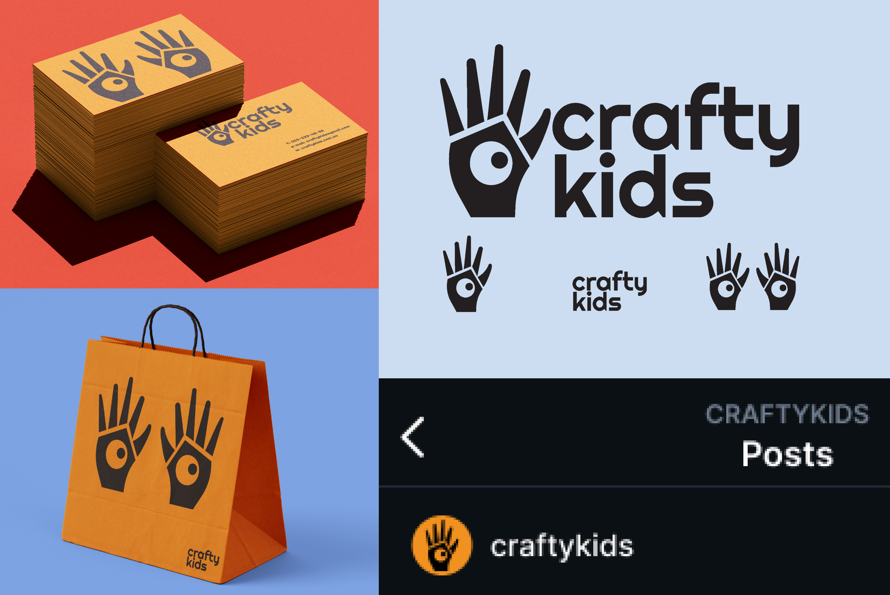
For Crafty Kids, I developed a combined logo that incorporates a graphic symbol and the company name.
Sets for young children aimed at developing skills (for example, fine motor skills) usually consist of a certain constructor/puzzle that the child has to assemble and are aimed at developing the muscles of the hands and fingers. Therefore, for the overall shape of the symbol, I decided to use the shape of a hand (the hand also clarifies that these are indeed craft sets).
I divided the shape of the hand into separate parts and emphasized the geometric nature of the shape as a hint at the "constructor/puzzle."
With the "hole" in the middle of the hand, I also wanted to highlight a characteristic feature of toys that are common in this category. (For example, geometric shapes that need to be threaded onto a string have holes; toys in the shape of boxes with holes for geometric shapes).
And to add playfulness and childlike quality to the logo, I made an eye from this "hole" and personified the symbol.
The font - Righteous, also emphasizes the geometric and constructive nature of the toys.