Logo for the brand of organic cosmetics "Iona"
Logo Design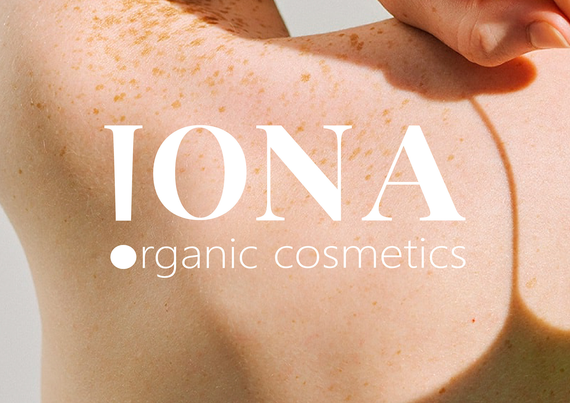
The work on the project was extensive and thorough, it was developed all starting from neyming, brandbuck and ending with the stamp of firm products.
Before starting the project work, it was necessary to study the target audience in detail and search for analogues, to find out their strengths and weaknesses.
During the search for the sketch, it was decided that the logo will be with the text part of the name. The reversed letter I, which serves as the first letter for the name of Jon and at the same time for organic cosmetics, also acts as a fictional sign and is an element of the firm style.
The color palette was chosen in gently pink, body colors.
#logotype #log #cosmetics #firma style #logotype #branding #identity #logogesign #GraphicDesign #logodesigner #named #branding #Logotypes #polygraphy #designpolygraphy #designer #illustrator #escis #esthetics #minimalism