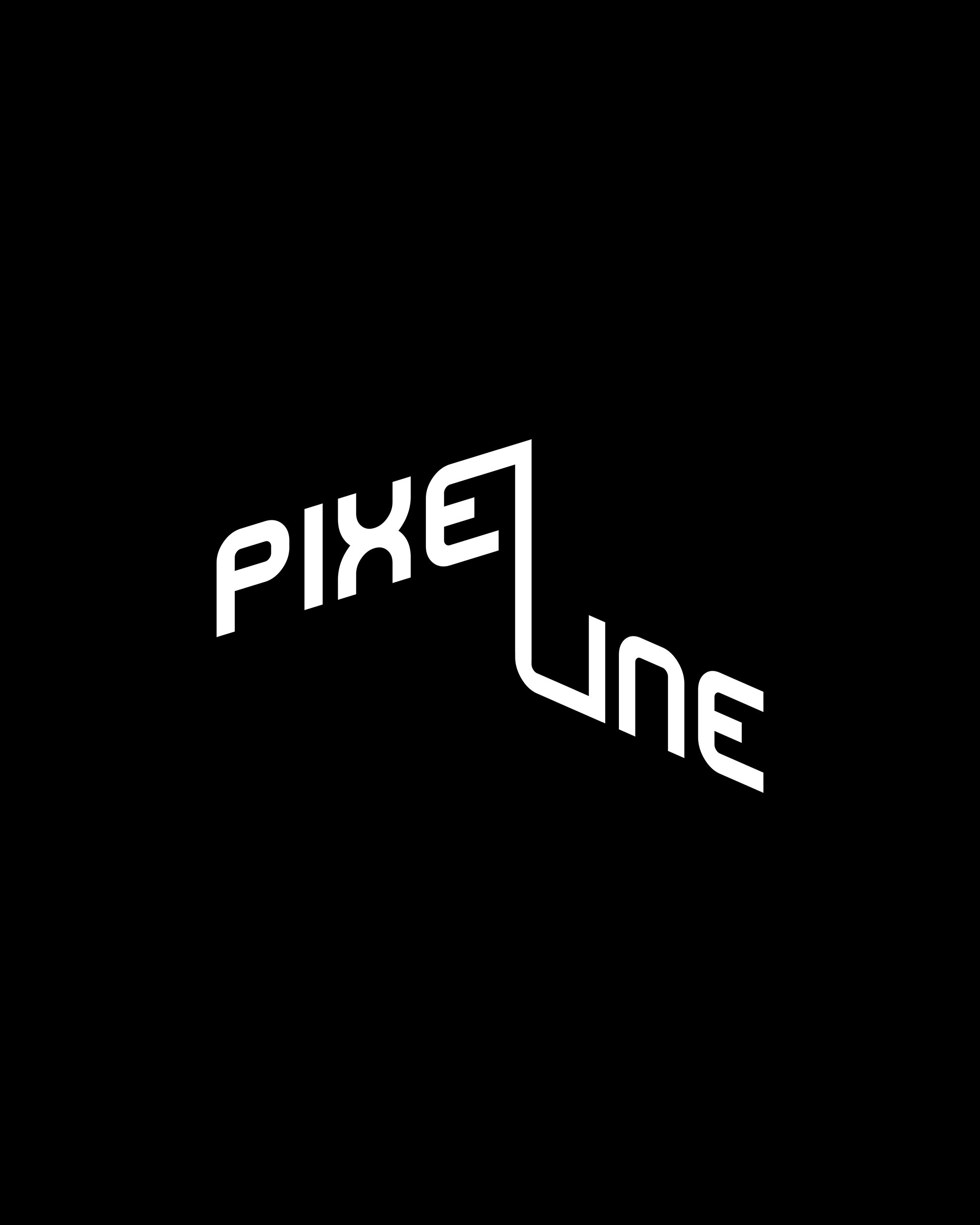
The logo is based on the brand name itself. The font is chosen in such a way as to associate with technologies and services in the digital space.
The main feature of the logo is the letter "L," which, like a line, connects the two parts of the word. This visual connection symbolizes the inseparability of processes / a clear "line" of strategy and success.
The main feature of the logo is the letter "L," which, like a line, connects the two parts of the word. This visual connection symbolizes the inseparability of processes / a clear "line" of strategy and success.