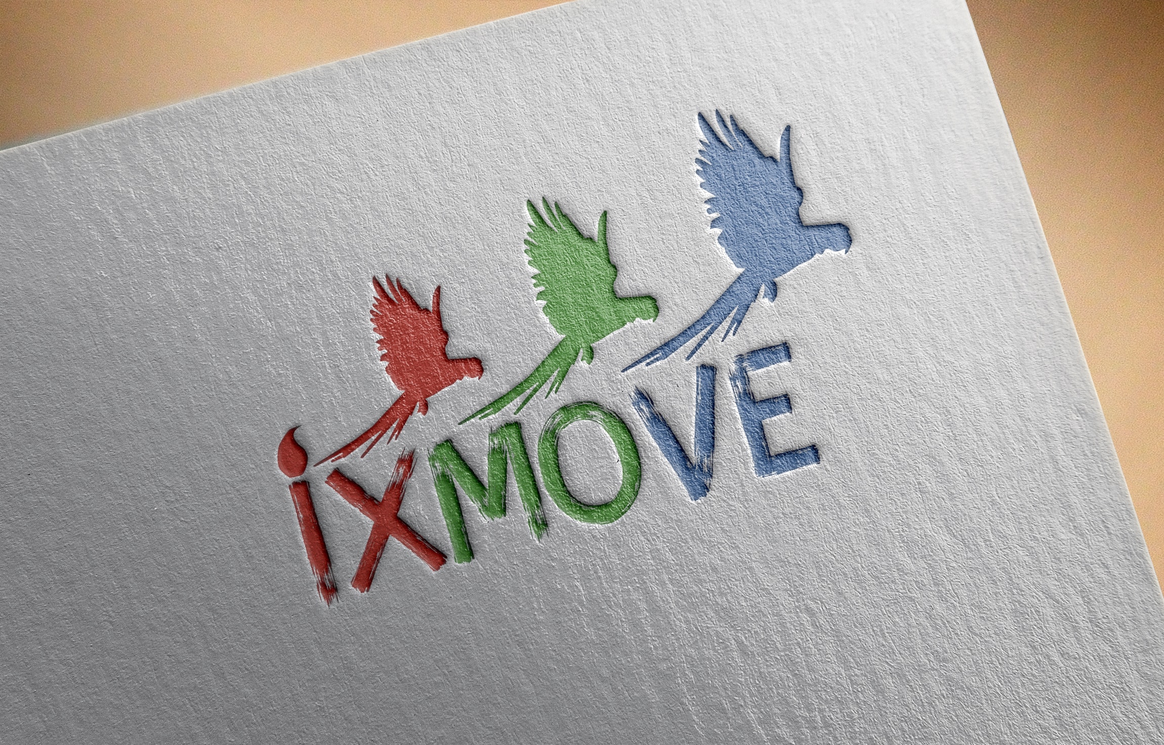
In the color solution of the logo, a scheme of three colors was used - red, green, blue, as a reference to the RGB color scheme to emphasize that the studio is engaged in digital animation, as in the digital world all images are made up of these colors. Even flying colour birds will emphasize the creativity and brightness of the studio’s thinking. And the increase in the size of birds means growth and progressivity.
The company. Also, flying birds is essentially a movement, and this word is in the name of the studio, which also creates a relationship between the name of the studio and part of the logo. A cyst above the letter "i" also emphasizes the connection of the studio with the creative process and drawing.
The company. Also, flying birds is essentially a movement, and this word is in the name of the studio, which also creates a relationship between the name of the studio and part of the logo. A cyst above the letter "i" also emphasizes the connection of the studio with the creative process and drawing.