Logo for the field "Metal Restoration".
Logo Design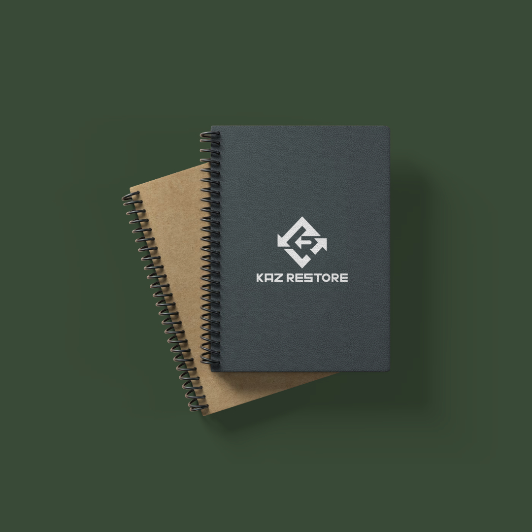
The logo is designed in the shape of a diamond-shaped sign, which consists of uppercase letters "K" and "R" from the name "KazRestore," as well as arrows. The direction of the arrows is counterclockwise, indicating a return to the starting point, i.e., renewal. Several options were offered to the client. There were a couple of revisions.
#logo #logotype
#logo #logotype