The work participated in a logo design competition for the training website https://freelancehunt.com/contest/rozrobiti-logotip-dlya-saytu-trenuvan/7518.html
-
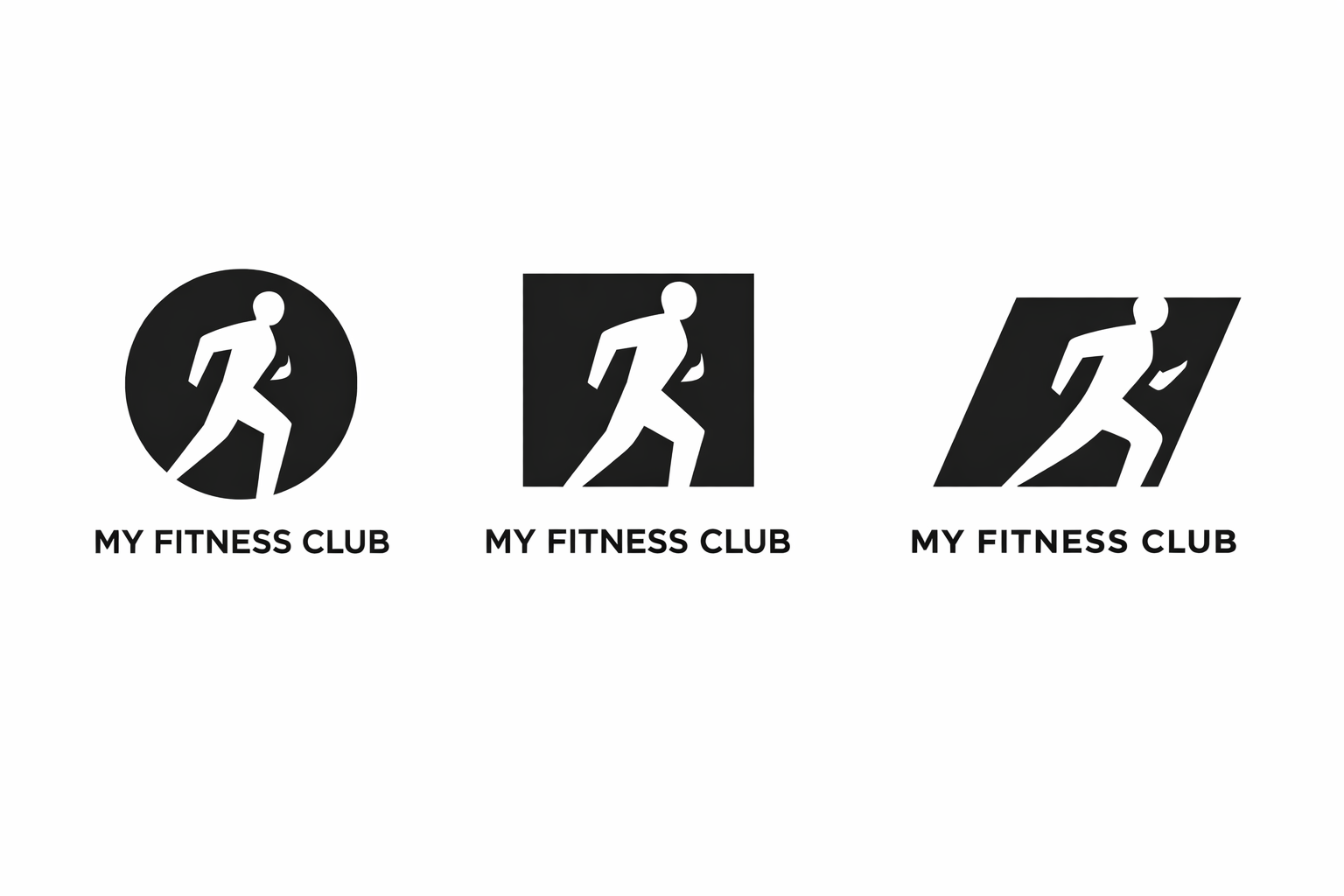
The logo is executed in a premium minimalist style using negative space, where the silhouette of a person is "cut out" from a geometric shape. This approach symbolizes forward movement, development, and inner strength. The black-and-white solution makes the sign universal and effective.
-
The logo is executed in a premium minimalist style using negative space, where the silhouette of a person is "cut out" from a geometric shape. This approach symbolizes forward movement, development, and inner strength. The black-and-white solution makes the sign universal and effective.