The logo. and identity. Construction company
Web Design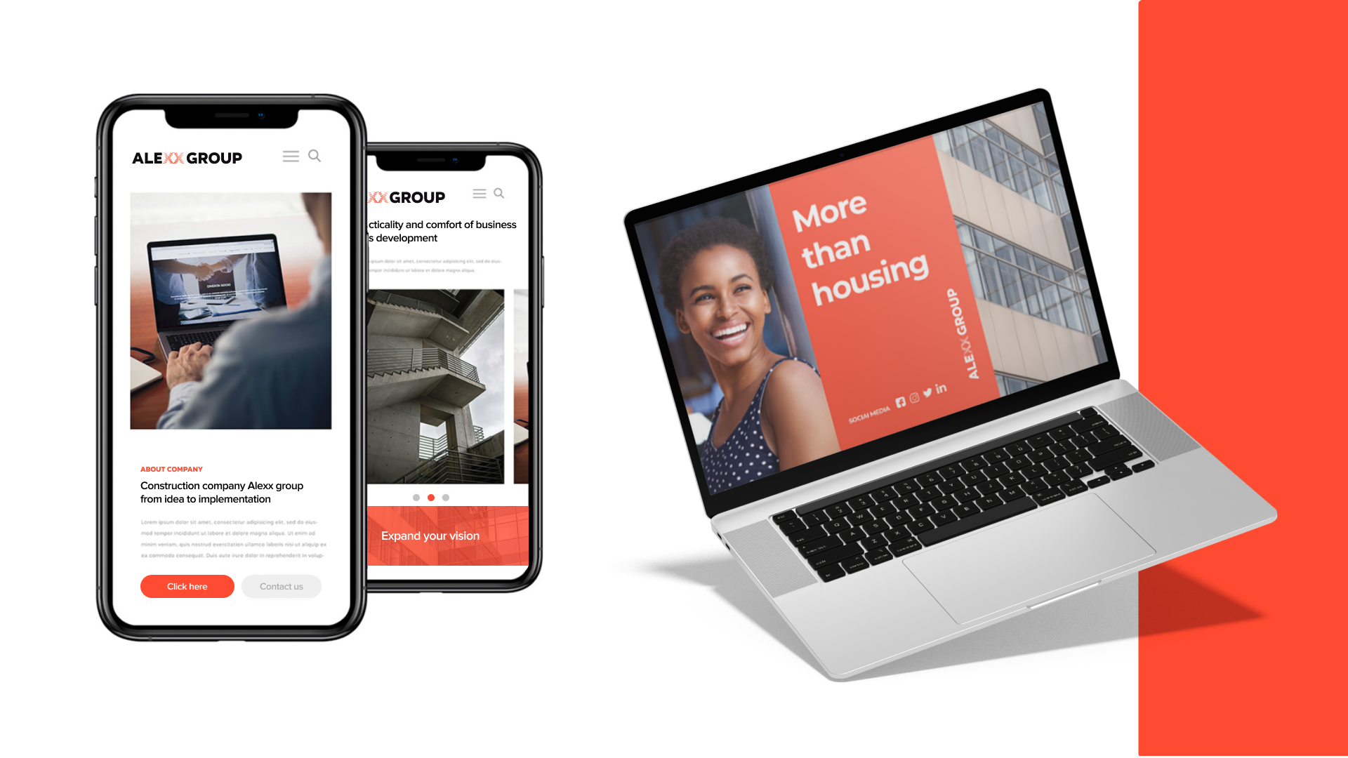
The company is engaged in the heating of the facades, on the European market for a long time.
The combination of the logo was ordered to unify the name of the company and the elements with which the construction will be compared.
So I was emphasized on the XX, which I did not fit, as if one layer is placed on the other, as well as in the construction.
The logo looked very easy, after which it was decided to extend the work over the company’s website.