Development of a concise visual identity for a brand with a northern character. The main task was to create a symbol that combines resilience, clarity of lines, and modern aesthetics.
What was done:
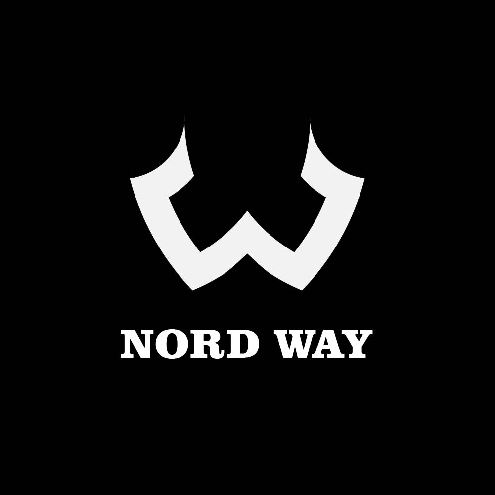
Geometric sign: The logo is based on a stylized letter "W," executed in a sharp-angled Scandinavian style. The shape resembles a compass, a crown, and the drawing of traditional runes.
Adaptability: Three color variations were developed (inversion on black, white, and brand blue backgrounds), ensuring clear readability of the sign on any medium.
Technical implementation: The logo is built according to strict geometric proportions. The vector grid is perfectly clean, allowing the layout to be used for laser engraving, embroidery on clothing, or the production of metal plaques without additional refinement.
Tools: Adobe Illustrator.
Style: Minimalism, Geometry, Nord Style.
#Logos #logo_design #identity #corporate_style #branding #minimalism
#geometry #Scandinavian_style #nordic_design #vector_art #vector #CNC_layout #laser_cutting #engraving
What was done:
Geometric sign: The logo is based on a stylized letter "W," executed in a sharp-angled Scandinavian style. The shape resembles a compass, a crown, and the drawing of traditional runes.
Adaptability: Three color variations were developed (inversion on black, white, and brand blue backgrounds), ensuring clear readability of the sign on any medium.
Technical implementation: The logo is built according to strict geometric proportions. The vector grid is perfectly clean, allowing the layout to be used for laser engraving, embroidery on clothing, or the production of metal plaques without additional refinement.
Tools: Adobe Illustrator.
Style: Minimalism, Geometry, Nord Style.
#Logos #logo_design #identity #corporate_style #branding #minimalism
#geometry #Scandinavian_style #nordic_design #vector_art #vector #CNC_layout #laser_cutting #engraving