Logo rebranding for an electrode manufacturer
Logo Design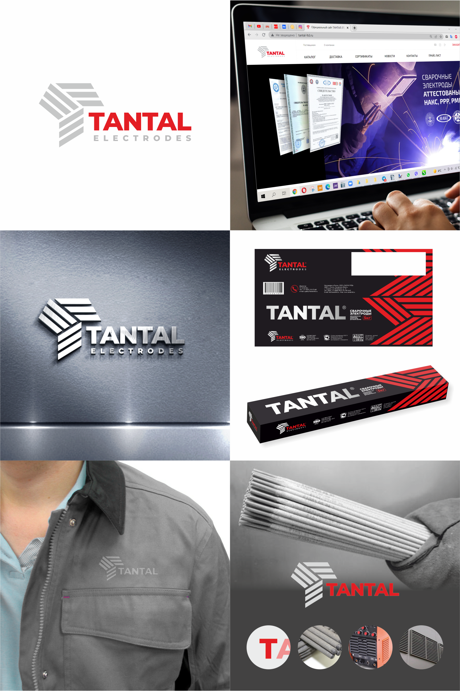
Rebranding of the logo and packaging design for the manufacturer of welding electrodes TANTAL LTD.
The shape of the updated sign still symbolizes the letter T, but also conveys an abstract, light and stylish association with packs of electrodes.
The original and stylish multi-faceted shape gives an appropriate association with construction or production. Also, the T-symbol resembles a ventilation grill in the room where welding is carried out, or on the welding machine itself.
Look at the company's website: tantal-ltd.ru
Find out more about this project here:
https://www.instagram.com/p/CaUWEc1gAdT/
#brandbook #logo #logobook #Guideline #branding #logodevelopment #logodesign #rebranding #brand #branddesign #guideline #visualidentity #identity #businesscard #graphicdesigner #logodesign #logodesigner #branddesigner #logominimalism #businesscarddesign
The shape of the updated sign still symbolizes the letter T, but also conveys an abstract, light and stylish association with packs of electrodes.
The original and stylish multi-faceted shape gives an appropriate association with construction or production. Also, the T-symbol resembles a ventilation grill in the room where welding is carried out, or on the welding machine itself.
Look at the company's website: tantal-ltd.ru
Find out more about this project here:
https://www.instagram.com/p/CaUWEc1gAdT/
#brandbook #logo #logobook #Guideline #branding #logodevelopment #logodesign #rebranding #brand #branddesign #guideline #visualidentity #identity #businesscard #graphicdesigner #logodesign #logodesigner #branddesigner #logominimalism #businesscarddesign