Logo, style, and brand book for a law firm
Corporate Style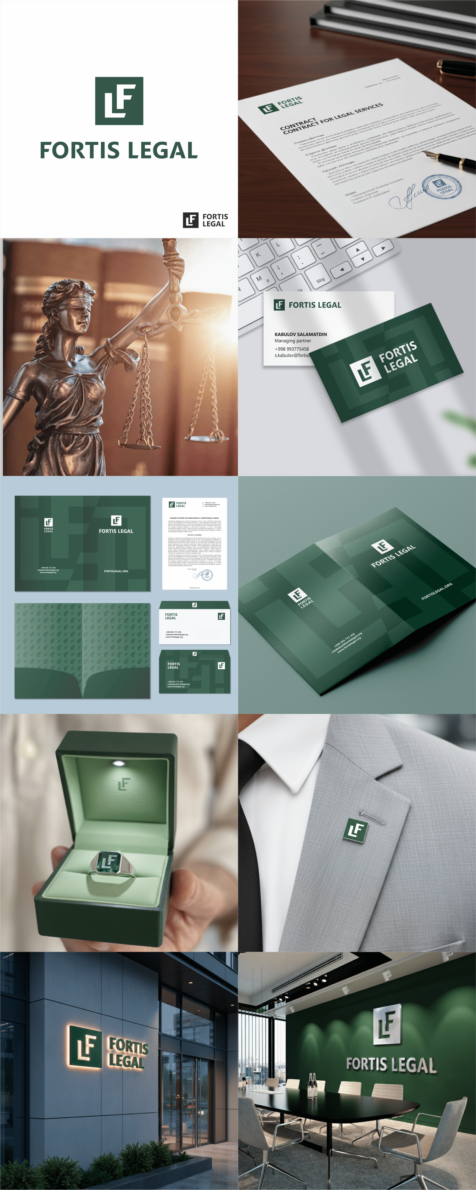
The company logo features a monogram of the two initial letters of the name FL, executed in a strict, businesslike style, reflecting the company's status and activities.
The letter F stands firmly on the base of the letter L, symbolizing the reliable legal
support or support of the company's specialists.
The monogram is located within a simple square shape, symbolizing stability and the comprehensiveness of the necessary services.
The edges of the letters are cut off, creating an invisible slanted line or upward movement vector, indicating dynamic development and growth.
The FORTIS LEGAL logo and corporate style are designed in Hunter Green.
#logo #logodesign #logomark #logobook #brandbook #corporatestyle #identity #brandguide #guideline #lawfirm