The city of Dnipro has its own logo (relatively new) and company style, with which you can get acquainted on this website:
http://www.dniprodesign.dp.ua/projects/logo/
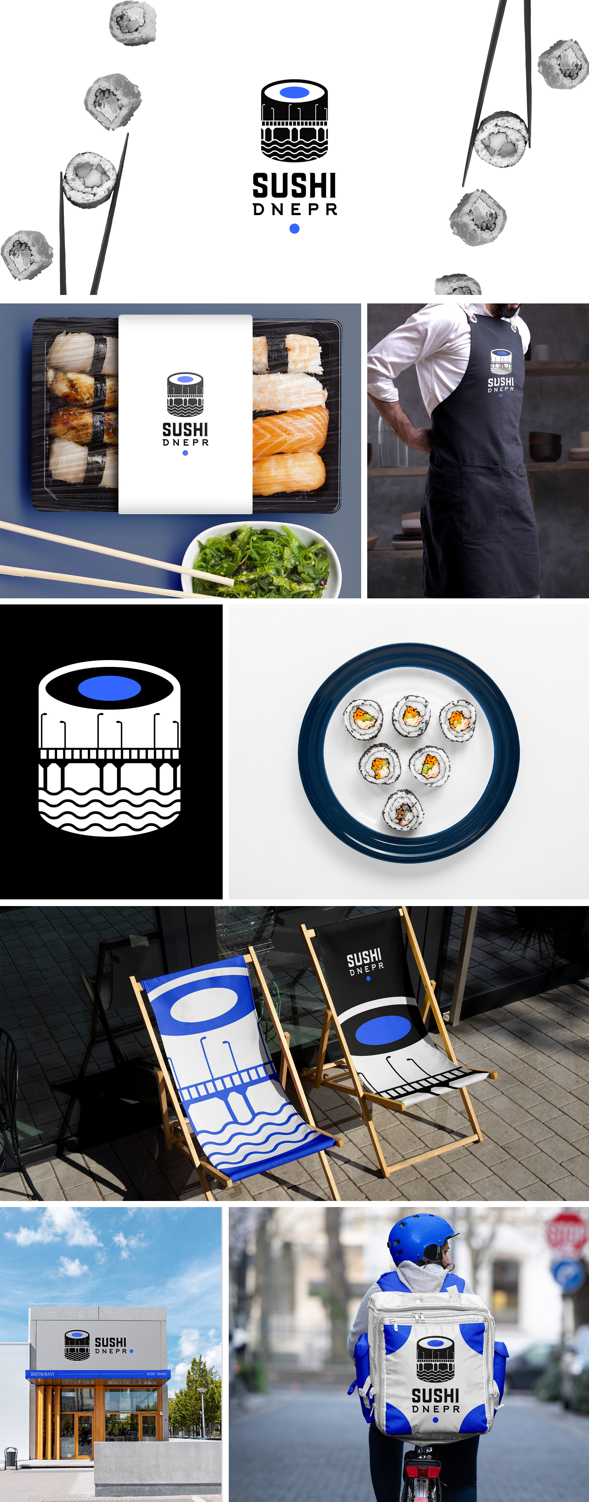
In the company style, waves are used.
In the Sushi Dnepr logo I also used waves, which is a reference to the main corporate style of the city.
The mark is the sochi roll + river and bridges. Simple, stylish and recognized.
To write the name, I created a font pair that looks harmoniously together, adds the sign and makes the concept more unique.
For the word SUSHI I used a font that fits under the subject of the land.
For the word DNEPR I used a font as much as the city's firm font, this font also looks good with waves.
http://www.dniprodesign.dp.ua/projects/logo/
In the company style, waves are used.
In the Sushi Dnepr logo I also used waves, which is a reference to the main corporate style of the city.
The mark is the sochi roll + river and bridges. Simple, stylish and recognized.
To write the name, I created a font pair that looks harmoniously together, adds the sign and makes the concept more unique.
For the word SUSHI I used a font that fits under the subject of the land.
For the word DNEPR I used a font as much as the city's firm font, this font also looks good with waves.