Logo of the Tio Tinto Wine Shop
Logo Design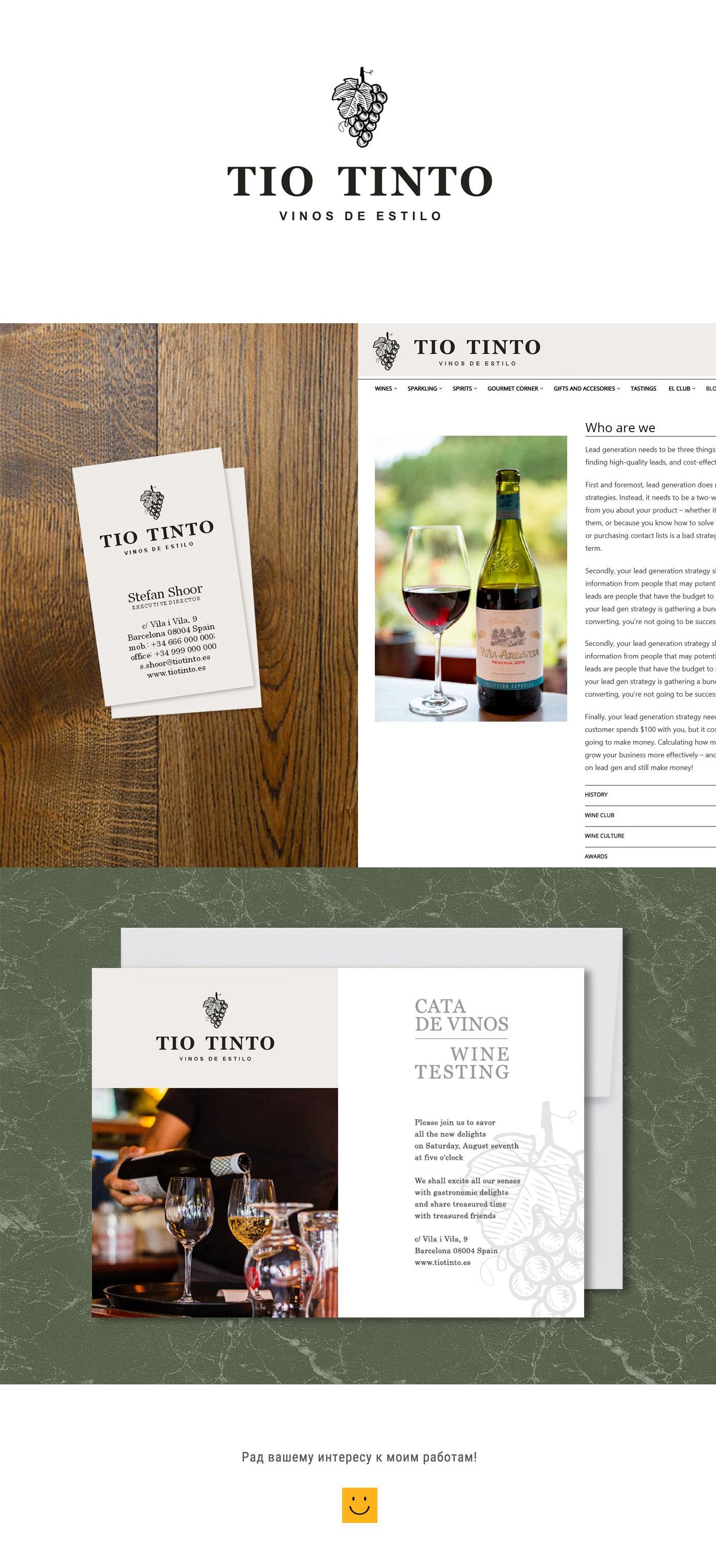
This logo was created for a wine store.
The logo consists of two parts: the grain grain and the text. The grape of the vineyard, a symbol of the vineyard, in some cases itself can serve as an imaginary element. Despite the fact that only black color is used, the imitation of the graving technique creates the impression of the presence of grey semi-tones.
The use of the graving technique and massive font with tracks is intended to create a retro style that is a clue to a long history and what is called old money.