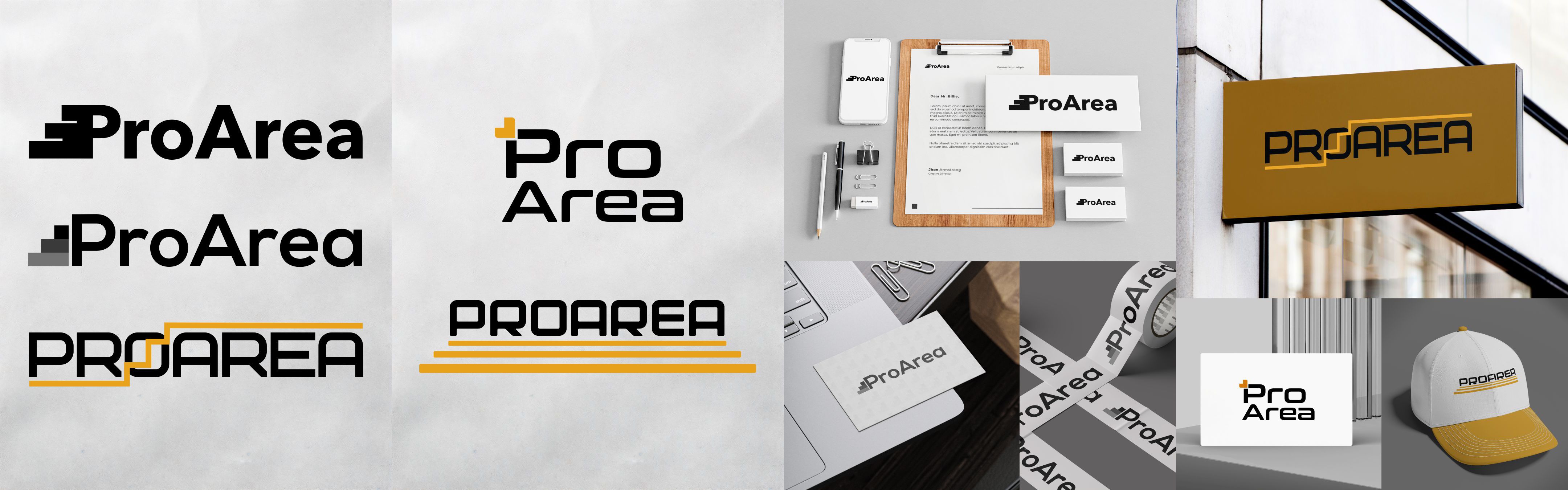
This is a series of five logo options, designed for a modern IT company that is dynamically developing in the field of mobile and web application development.
The main goal is to convey a sense of technological advancement, movement, and professional growth through a simple yet expressive form.
The visual concept is based on combining geometric shapes and the association of development — stairs.
The palette is black and white with the possible use of an accent mustard color, which gives the identity expressiveness without losing restraint.
Each logo has been tested in real applications: signs, documentation, corporate media — to check versatility and recognizability in different contexts.