Logos
Logo Design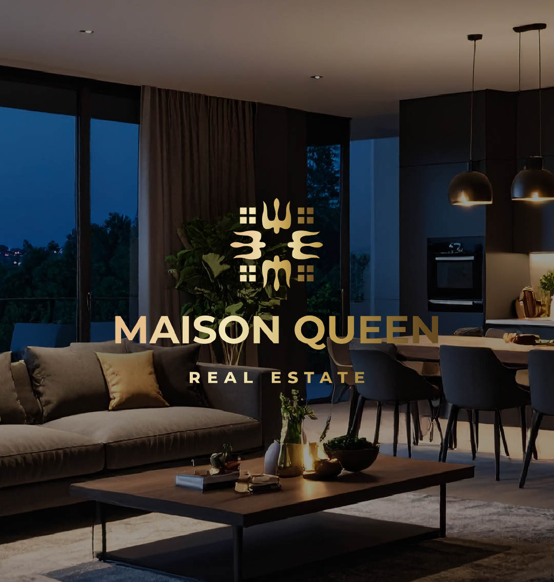
Logo for a real estate agency.
Clients — 2 Ukrainians who opened their own real estate agency in Italy. It was important to add our trident if possible and for the logo to symbolize uplift and stability.
Solution: In this logo, I used a stylized form of the Ukrainian trident, complemented by geometric squares.
The square in Ukrainian symbolism represents well-being, peace, abundance, and is also an embodiment of stability, reliability, and resilience.
Four squares form a window — this image I consciously integrated as a symbol of a house, directly referring to the real estate sector.
The sans-serif font emphasizes modernity, strictness, and the business nature of the agency, adding a sense of confidence and stability to the logo.
Clients — 2 Ukrainians who opened their own real estate agency in Italy. It was important to add our trident if possible and for the logo to symbolize uplift and stability.
Solution: In this logo, I used a stylized form of the Ukrainian trident, complemented by geometric squares.
The square in Ukrainian symbolism represents well-being, peace, abundance, and is also an embodiment of stability, reliability, and resilience.
Four squares form a window — this image I consciously integrated as a symbol of a house, directly referring to the real estate sector.
The sans-serif font emphasizes modernity, strictness, and the business nature of the agency, adding a sense of confidence and stability to the logo.