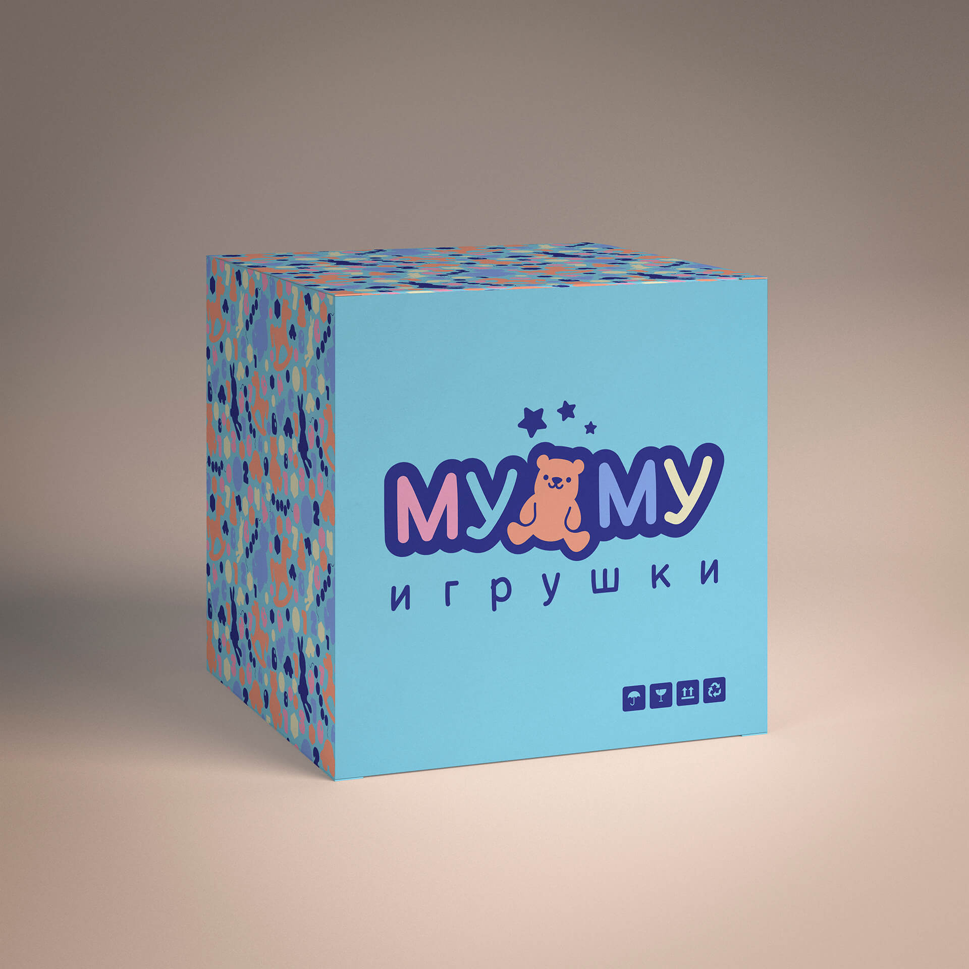
Logo for the company "MU-MU", which is engaged in the manufacturing of toys.The font:
It was taken a soft, slightly curved font, imitating the letter with a mark.The text is perfect for children's theme.The composition:
He added a mouse to the name of the company, showing a company that sells toys.The stars over the mouse are a symbol of dreams and desire to reach the sky, playing toys.We all dreamed and flown in the clouds in our childhood (some of us still fly so).Under the logo added the inscription "toys" which makes the logo more sold and adds the overall composition through the game of mass (big, thick text and small thin).The Color:
All colors are made in pastel tones, except blue (women’s audience simply loves pastel tones).The blue color adds contrast and adds volume to the logo.The color is located in the chess order, warm-cold, this supplements the overall composition and makes it more interesting.#toys #logotype #sales #package #production #wholesale #design #for children #identity #branding #logo #design #firma style #graphic design #market #brand #logodesign #business #marketing #positioning #hobby #children #dose #family