This visual combines the idea of the FTP monogram with sharp, dynamic shapes. This creates a unique logo that is unlike typical symbols associated with trucks, while still conveying a sense of strength and movement.
Direction: The design is clean, minimalist, and modern. It uses sharp lines and angles to symbolize power and speed, which are key for "Force Truck Parts."
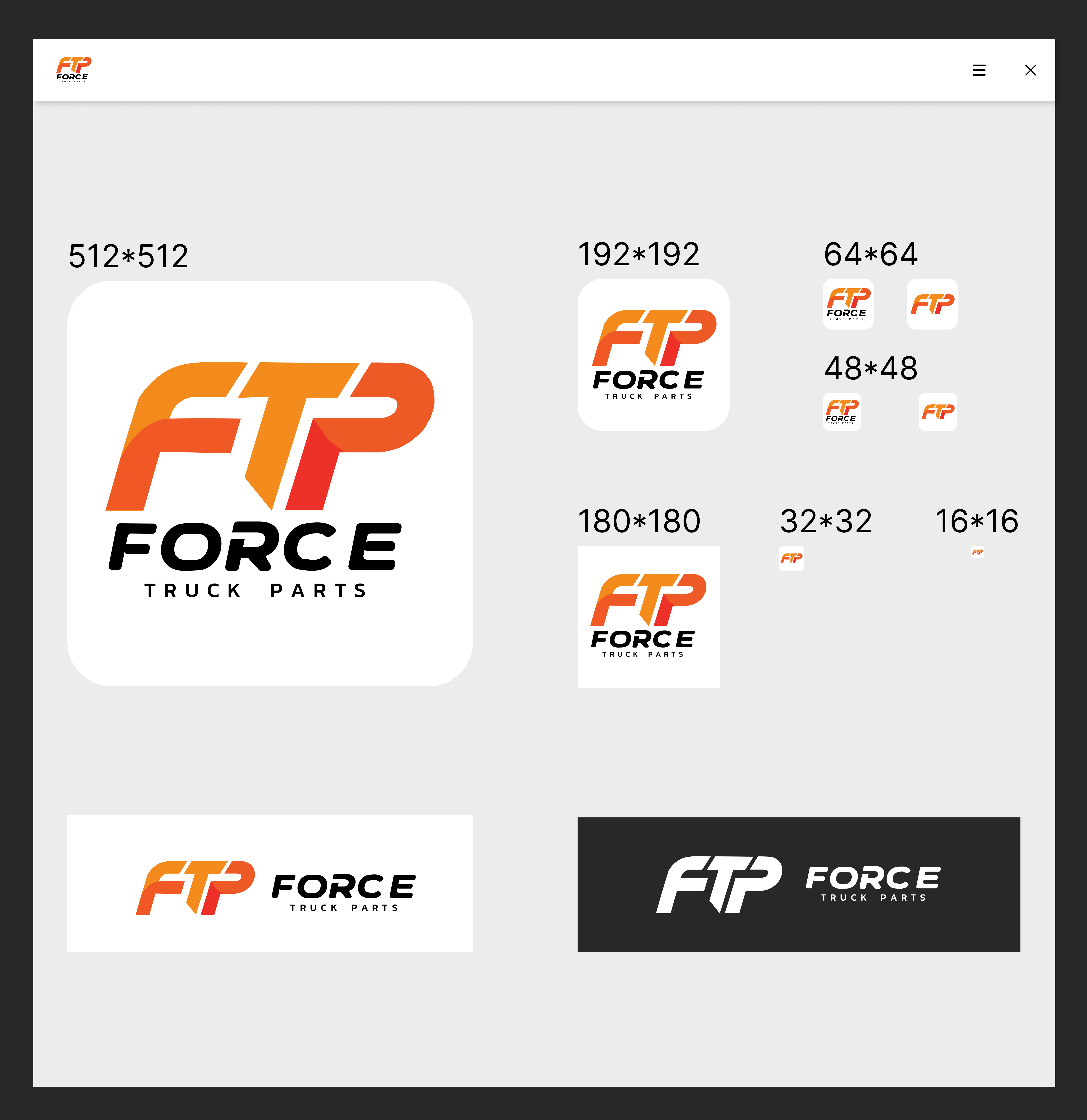
Symbol: The letters F, T, and P are combined into one cohesive, dynamic symbol. This makes it very recognizable and easily readable even in small sizes.
Color: Your palette of bright orange and reddish-orange shades is used, giving the logo energy and appeal.
Direction: The design is clean, minimalist, and modern. It uses sharp lines and angles to symbolize power and speed, which are key for "Force Truck Parts."
Symbol: The letters F, T, and P are combined into one cohesive, dynamic symbol. This makes it very recognizable and easily readable even in small sizes.
Color: Your palette of bright orange and reddish-orange shades is used, giving the logo energy and appeal.