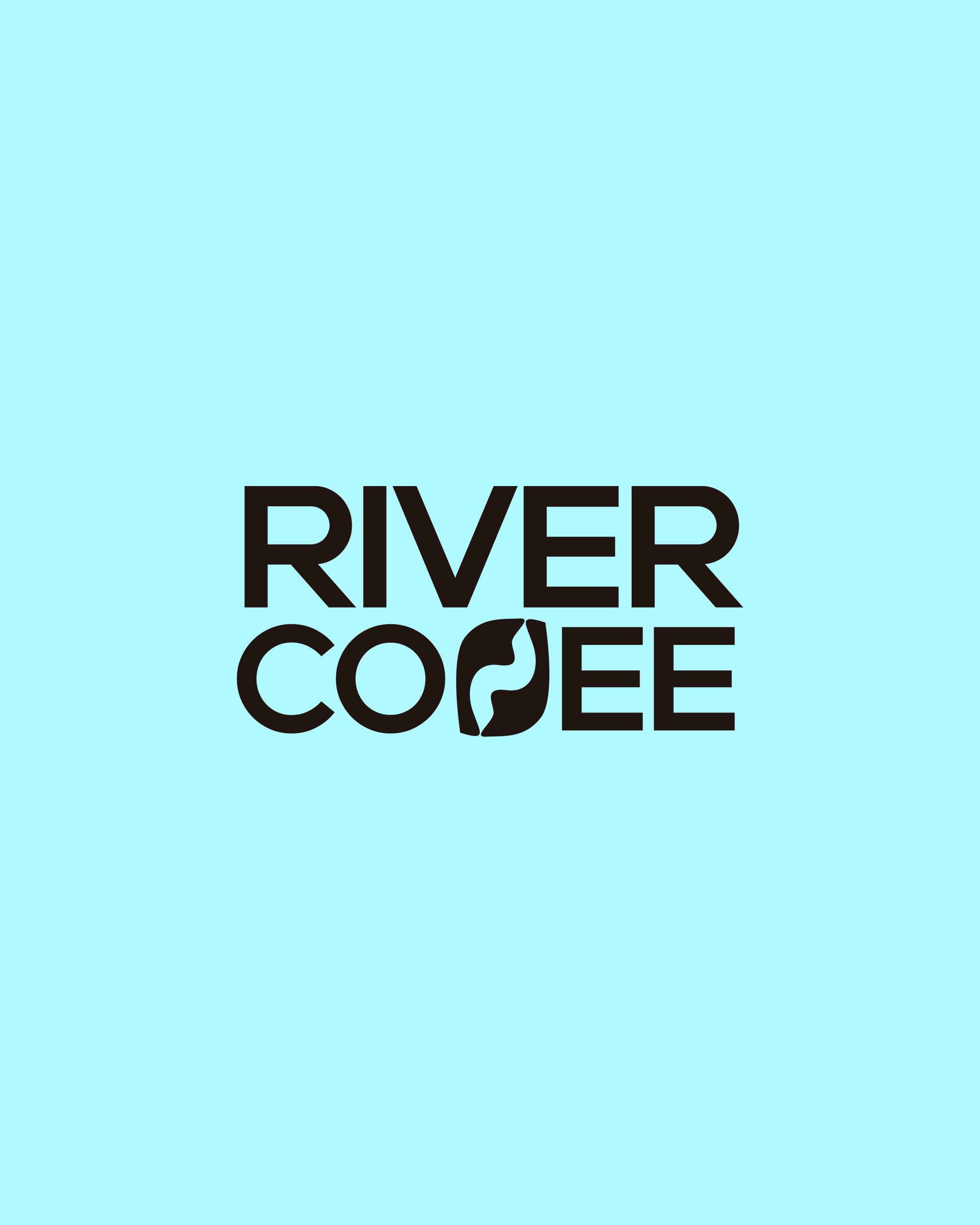
The main feature of the design is hidden in the very word COFFEE. The two letters "F" are layered on top of each other, forming a recognizable silhouette of a coffee bean. But if you look more closely, you can also see the curve of a river inside. This visual solution symbolizes the inseparable connection between the art of roasting and the natural tranquility of the flowing water nearby.
A sky-blue palette was consciously chosen as the main color of the brand. It not only emphasizes the river theme but also gives a sense of lightness, space, and the freshness of the morning breeze.
A sky-blue palette was consciously chosen as the main color of the brand. It not only emphasizes the river theme but also gives a sense of lightness, space, and the freshness of the morning breeze.