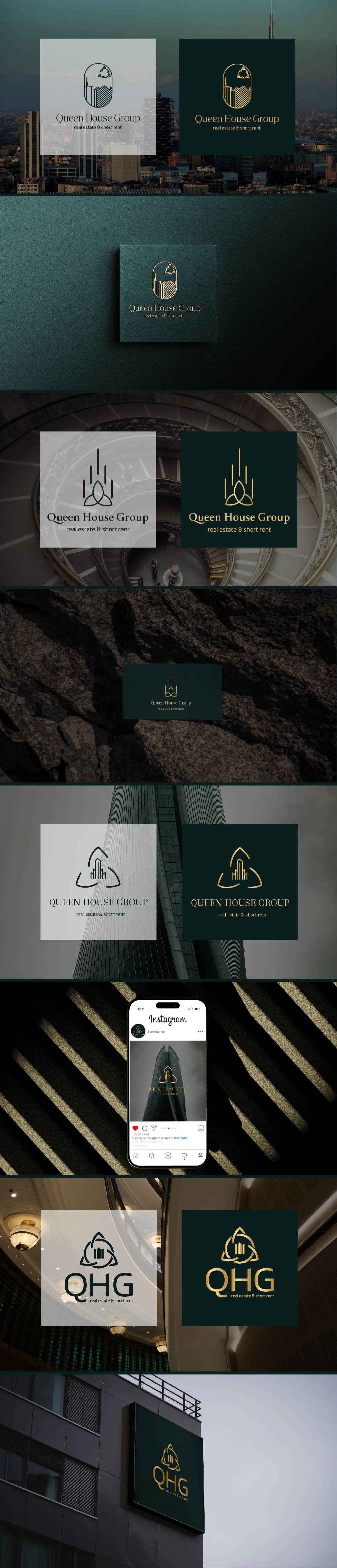
Logo options for a real estate agency in Milan.
In the logo, I wanted to combine the symbol of the triquetra, which represents the power of feminine energy (the agency owner is a woman, and this symbol holds great significance for her and must be included) + an image of a house + the name of their agency.
All options feature abstract representations of a building and the triquetra in various forms, modified in such a way that it can be read in the logo but is not obvious. Colors: gold and dark green, which emphasize the agency's status, should reflect sophistication and luxury.