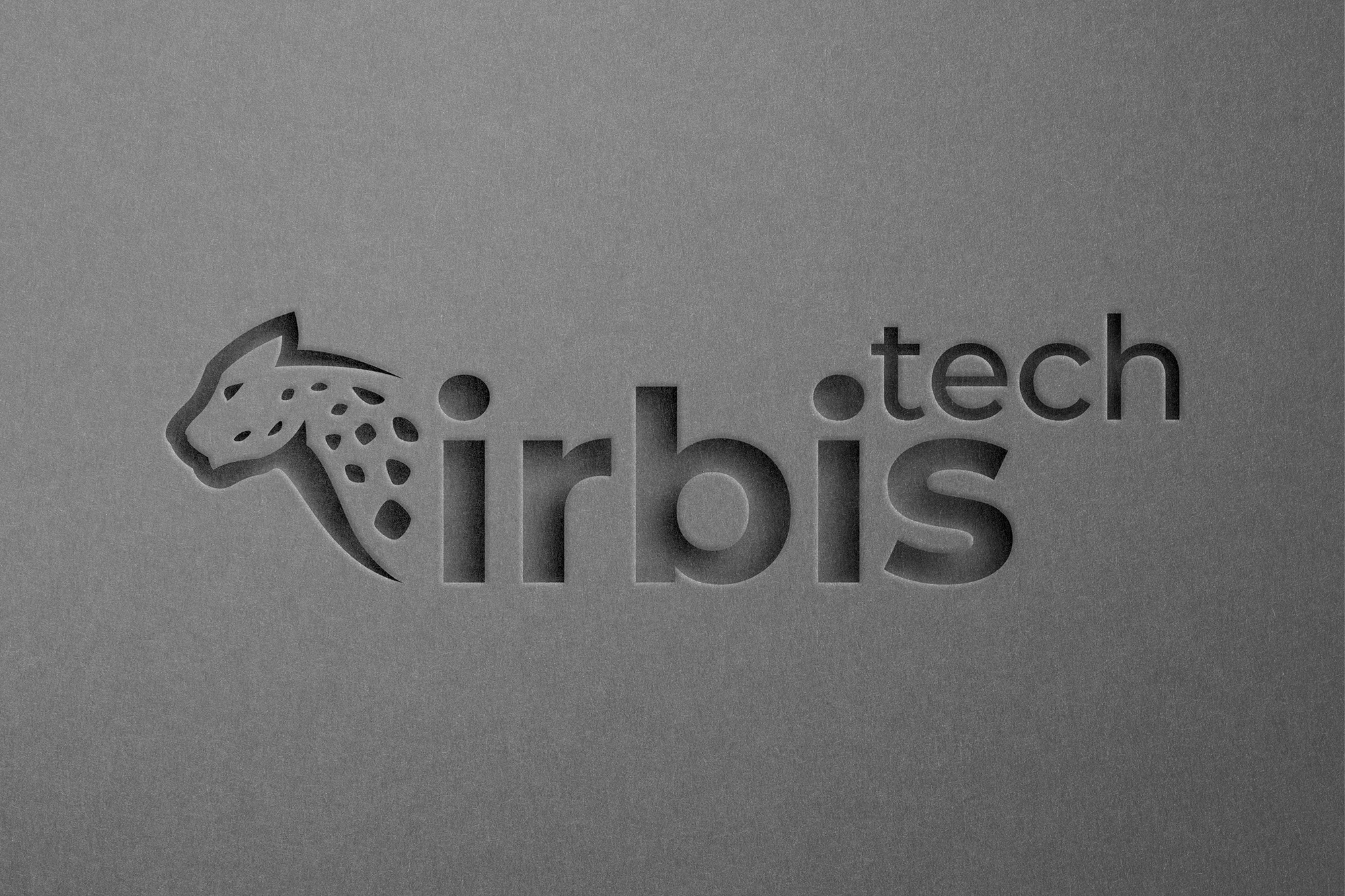
Logotype for “Irbis Tech”. The company is engaged in manufacturing equipment for dry ice cleaning.
The task:
Develop a logo so that you do not lose the recognition of current customers.
The Decision:
· It was decided to use fat font in combination with thin font. This was done to focus on the first word of the name and thus give more rhythm to the logo.
Compared to the old sign, the new sign has more smooth lines and a fast silhouette.
Color: blue with a shade of bird.
The color range was decided to move a little from blue, to the side of the stock. The pink color gives freshness, because. This color is still not so massive and is perceived as original for the consumer.
#originality #branding #logo #design #firmennystyle #suchoyled #branding #marketing #mark #logotypes #brand #cleaning #identity #logodesign #style #moving #irbis #marketing #positioning #presentation #bars #tm #mark #bridge