Logo for Reco
Logo Design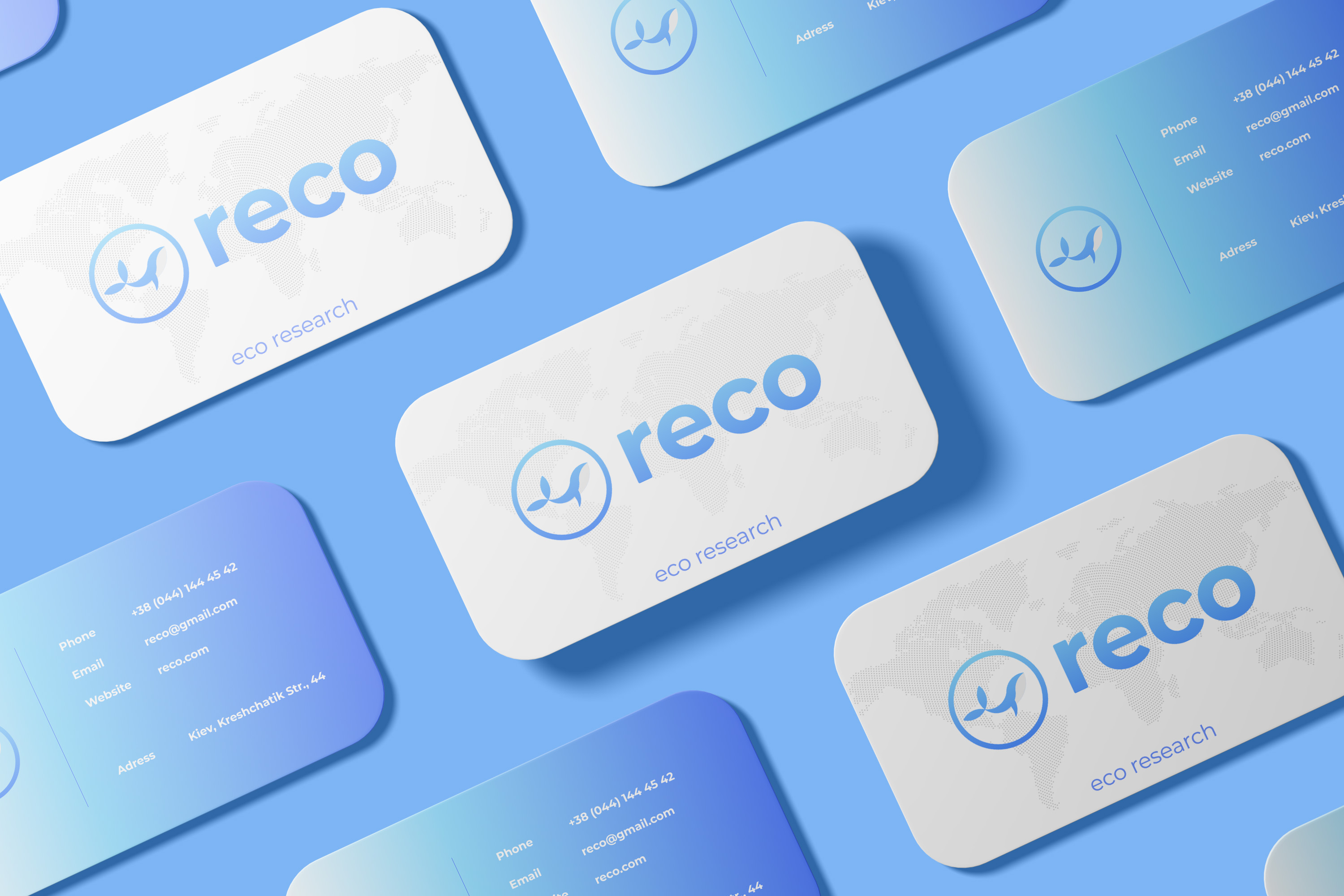
It was necessary to develop a logo that will look organically both in the digital space and on the print ports. The client saw the logo in the font form with a small graphic.
Decision
There was a graphic logo and graphic element. For the foundation of the font part was taken the Montserrat font with further improvement. As a graphic element, the whale was depicted as a symbol of a pure world ocean. It has been placed in a circle that is in this situation a symbol of our planet.