The goal is to create a logo that symbolizes support and support.
The font:
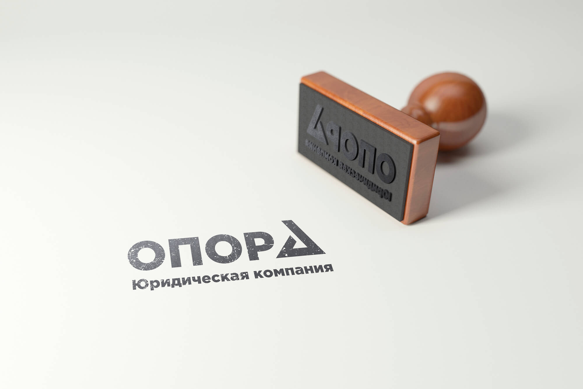
It was chosen a fat, geometric font without tracks.
This font symbolizes a strong foundation and support, which should be brought to the audience.
The Color:
A brown color was chosen for the name and a little brighter for the sign, and the logo looks balanced.
The Decision:
In the final, three options of the logo were proposed.
As a result, the choice fell on the logo with the emblem of support and replacing the letter "A". The symbol perfectly fit into the composition and it added more importance to the logo, making it unique.
Also included in the projects:
• Corporate style;
The website.
#logotype #legal company #design #jurist #help #support #consultation #firma style #graphic design #branding #marketing #logotypes #brand #colour #business #service #development #firstyl #income #composition #documents #schrift #logo #design
The font:
It was chosen a fat, geometric font without tracks.
This font symbolizes a strong foundation and support, which should be brought to the audience.
The Color:
A brown color was chosen for the name and a little brighter for the sign, and the logo looks balanced.
The Decision:
In the final, three options of the logo were proposed.
As a result, the choice fell on the logo with the emblem of support and replacing the letter "A". The symbol perfectly fit into the composition and it added more importance to the logo, making it unique.
Also included in the projects:
• Corporate style;
The website.
#logotype #legal company #design #jurist #help #support #consultation #firma style #graphic design #branding #marketing #logotypes #brand #colour #business #service #development #firstyl #income #composition #documents #schrift #logo #design