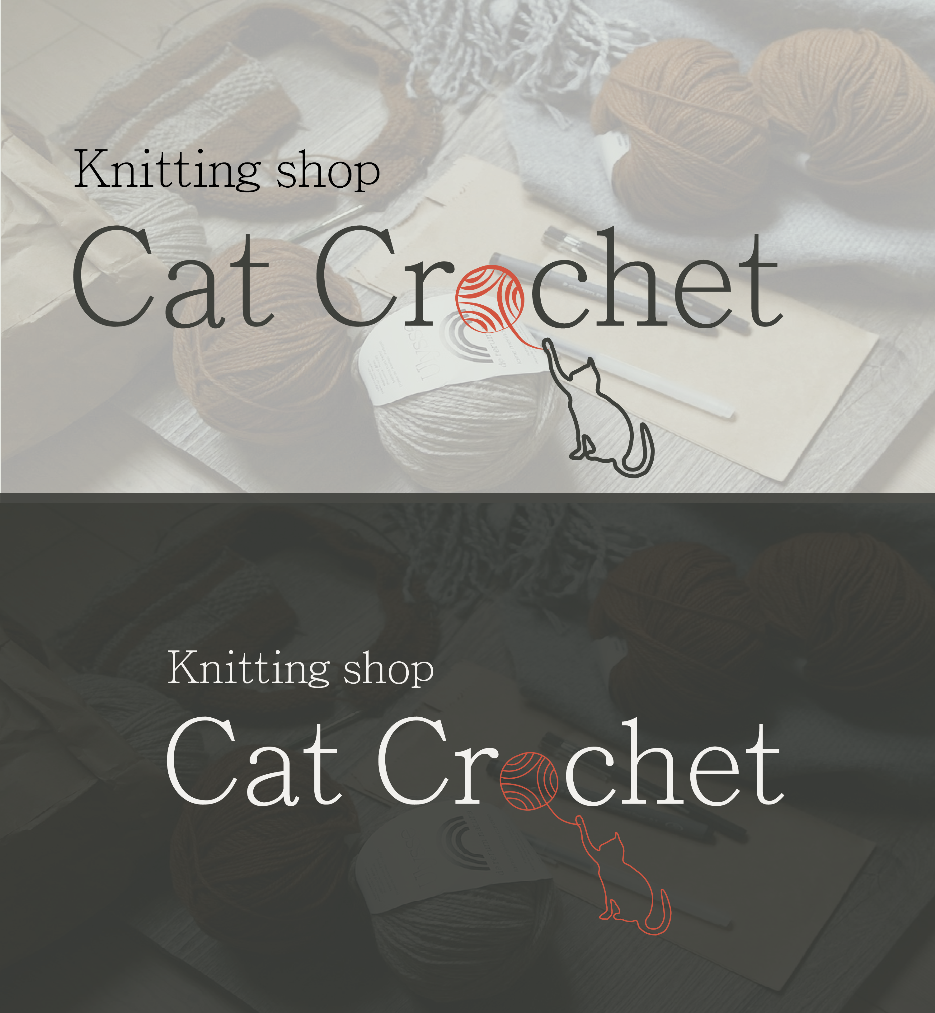
The buyer wanted a logo for the snack store using a graphic element. The foundation was the image of the same spray and the cottage that is playing with it.
The logo itself is minimalist, as the target audience is mixed - from older people to young people, so the logo was pleased to be readable, simple, but interesting and memorable. The logo is developed in 1 day.
The logo itself is minimalist, as the target audience is mixed - from older people to young people, so the logo was pleased to be readable, simple, but interesting and memorable. The logo is developed in 1 day.