Logotype and Firm Style Uniq
Logo Design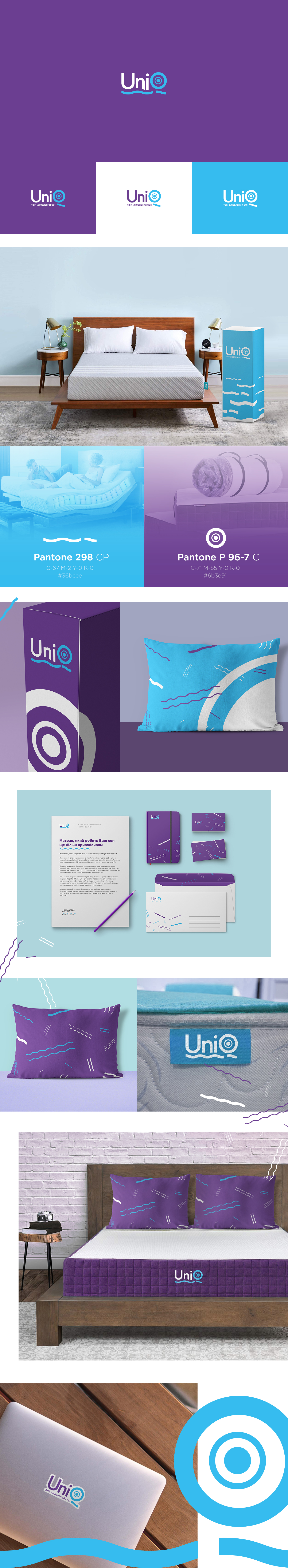
Development of the logo and firm style for the company engaged in the development and sale of mattresses in the box, Bed-in-Box.
In the form of the wave which emphasizes the text set reflects the softness and flexibility of the mattresses. Also in the letter Q is displayed the compactness of such mattresses, and the possibility of scrolling them into a small roll.
In the form of the wave which emphasizes the text set reflects the softness and flexibility of the mattresses. Also in the letter Q is displayed the compactness of such mattresses, and the possibility of scrolling them into a small roll.